A Volatile Market Presents Bullish and Bearish Chart Opportunities Right Now
Lede
With the weekend here, let’s look at some bullish and bearish set-ups. We will be releasing 10 new screens to Pattern Finder next week, and all of these charts come from them.
Preface
The new screens look across different time frames and focus either on short-term congestion points (seen as pink lines in our charts) or longer-term trend support and resistance (seen as a red and green line, respectively, in our charts).
Some screens look for timeframe agreement, others focus on just one time frame.
Beyond that, these are the commonalities to all of them:
➊ Rising relative strength on the bullish side, or decreasing relative strength on the bearish side.
➋ Up trends in the last day, 3-days, 7-days, 10-days and 4-weeks on the bullish side, or downtrends in those same time frames on the bearish side.
➌ Buying volume outpacing selling volume by 30% or more on the bullish side, or selling volume at 10% or more than buying volume on the bearish side.
➍ Opportunistic profit zones where the distance to the next upside resistance is larger than the distance to the next downside support for bullish trades, and vice versa for the bearish side.
These congestion points and trending support and resistance are proprietary charting algorithms to Pattern Finder.
➎ A ‘Buy - Sell Rating’ of 75 or greater (out of 100) on the bullish side or 25 or less on the bearish side.
We use a proprietary formula which puts heavier weight on the shorter-term, to create a rank system where stocks that have heavy buy to sell volume, strong RS, and strong stock returns get a high rating and stocks with high sell to buy volume, weak RS, and weak stock returns get a low rating. A score of 100 indicates the strongest buying activity and a score of 1 indicates the strongest selling activity.
This is all explained more elegantly in the 2 min 58 second video below:
Now we turn to the charts and we start with the bullish side.
Bullish Charts
We started with a multi-timeframe screen for bullish charts and landed on ticker MTW, in the producer manufacturing sector:
The Manitowoc Co., Inc. provides engineered lifting solutions. The firm designs, manufactures, markets and supports product lines of mobile telescopic cranes, tower cranes, lattice-boom crawler cranes, boom trucks and industrial cranes under the Grove, Potain, Manitowoc, National Crane, Shuttlelift and Manitowoc Crane Care brand names.
We start with the 3-year chart. We let Pattern Finder draw in all the congestion lines, trend support and resistance and we labeled the cup with handle about one and a half years ago.
We drew in the up trend and then tagged the upside profit zone in green and the downside loss zone in red.
We can zoom in on this chart for clarity and remove color from the parts of the chart that we aren’t focusing on:
Since this came from a multi-timeframe screen, the 18-month chart should look opportunistic as well.
Here is the 18-month chart, and this time we draw the profit zone to the Fibonacci extension while the loss zone remains unchanged.
We then turned to a screen for 18-month charts that focused solely on trend support and resistance, and discarded intermediate-term congestion lines.
So, we share that chart, but without the pink lines, for ticker VRT.
VRT is in the electronic sector:
Vertiv Holdings Co. engages in the design, manufacture, and service of critical digital infrastructure technology that powers, cools, deploys, secures and maintains electronics that process, store and transmit data. It also offers power management products, thermal management products, integrated rack systems, modular solutions, and management systems for monitoring and controlling digital infrastructure.
Here is the 18-month chart:
We zoom in on the chart to highlight the up trend formed by higher lows on trending support (red line), and the wedge with more upside to resistance than downside to support.
Lastly we plucked a chart out that had a decent 3-year chart, and we used both trend resistance and congestion lines as markers for profit and loss zones.
This is ticker GLBE in the retail trade sector.
Global-e Online Ltd. engages in the provision of cross-border e-commerce solutions.
For full disclosure, the author is long this stock.
Here is the 3-year chart:
We can zoom in and explicitly mark the profit and loss zones.
Next we turned to some bearish charts.
Bearish Charts
We started down trending 3-year charts and trading zones defined by the congestion lines (pink lines):
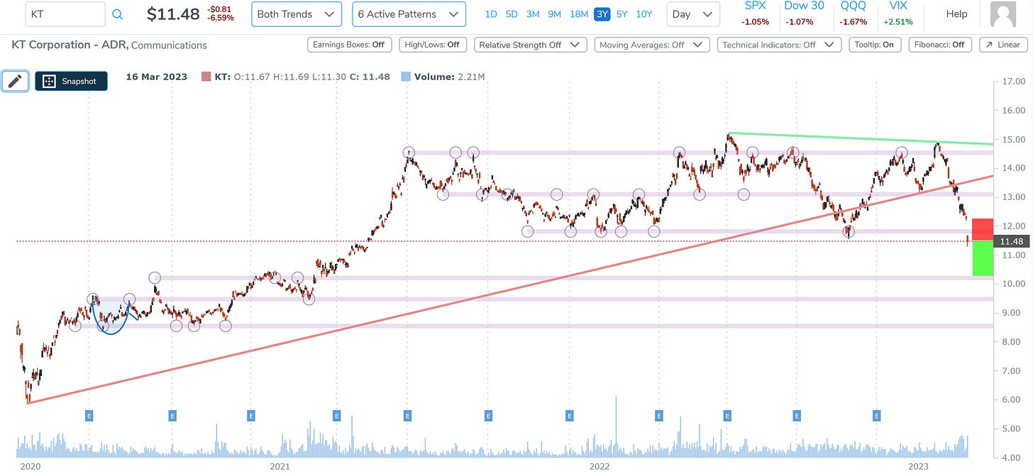
This is ticker KT in the communications sector:
KT Corp. engages in the provision of integrated telecommunication services. The company operates through the Customer and Marketing businesses.
Here is the 3-year chart, where we draw in the loss zone (higher price) and the profit zone (lower price):
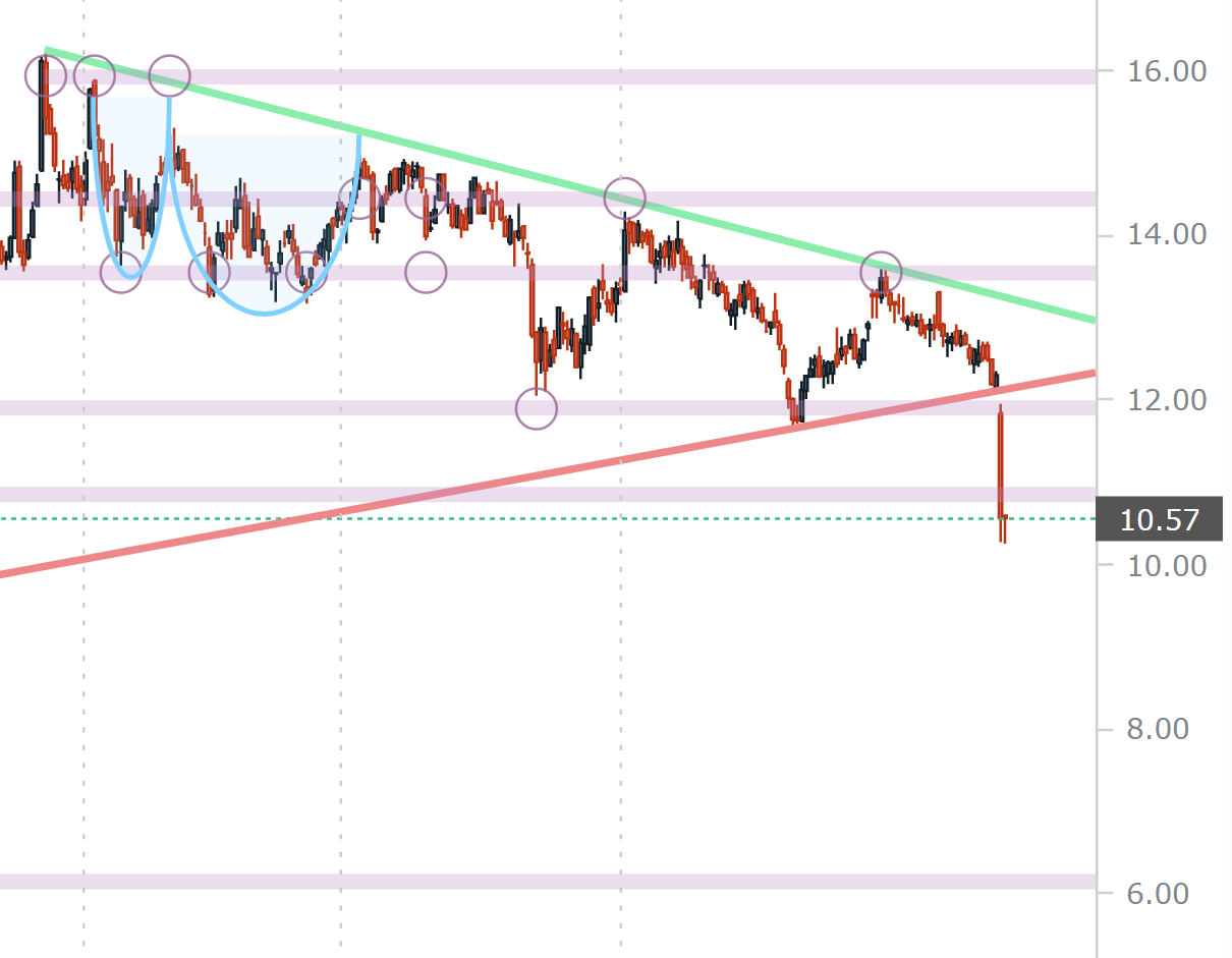
When we zoom in, it’s easier to see that the stock is in free fall, is through trend support and the next next congestion lines (pink lines).
We drew the loss zone (higher stock) at the point of the recent gap. A trader could choose the congestion line at ~$12 for a tighter stop.
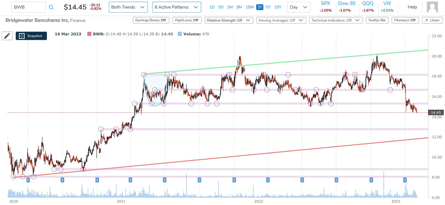
We stayed with this screen and looked at ticker BWB in the finance sector:
Bridgewater Bancshares, Inc. is a holding company, which provides retail and commercial loan and deposit services. It offers deposits, lending, professional services, and business services.
Here is the 3-year chart, and we can see the stock has a serious down trend after it touched trend resistance and went through the next three congestion lines (pink lines):
We can zoom in to see the down trend after resistance (green line) was struck.
The profit zone would be down to the next congestion line (~$13), and the loss zone would be back up at the nearest congestion line above the current price or ~$15.
Finally, we looked at ticker FPI in the finance sector.
Farmland Partners, Inc. operates as a real estate investment trust. the firm engages in the management and acquisition of farmland and land with agricultural development potential.
We again turn to the 3-year chart and note that the stock has broken through trend support (red line) and the next two congestion lines.
We then zoom in and see that a profit zone could go all the way down to the next congestion at around $6 and the loss zone would either be the nearest upside congestion at ~$11, or more likely the one above it at ~12.
Conclusion
This was just a taste of Pattern Finder’s capability. Soon, Pattern Finder members will get these set-ups in daily emails, and there will be a “click of a button” to mark up charts as they are marked up here, along with the 10 new screens.
We invite you to discover the benefits of Pattern Finder for yourself by visiting the page below, and before the price hikes after we add substantial capabilities: Learn about Pattern Finder

