
Another Pattern Finder Upgrade and Then... SPX, AAPL, Bullish Charts, and a Runner

Lede
What if you could open any chart and instantly see the setup from the long and short side?
Hold that thought.
Preface
The development of Pattern Finder has been a great experience, and today we take the next evolutionary step forward that we have noted, now, for months.
Automatically drawn and measured distance to nearest support and resistance is now live in the product.
Today, we’ll start with the S&P 500, then Apple (AAPL), then look for bullish charts and one possible ‘runner’ off of earnings today.
But the real power rests with you - create any custom screen, look at any stock, or use our screens, to find and perfect your trading process.
Off we go…
S&P 500
In our last post we noted how tight the trading range was for SPX.
A breakout (or breakdown) is coming, until then, we see no true bullish or bearish impetus in the index.
And, now, we allow Pattern Finder to draw all of it - the full chart markup down to the last 0.1%; congestion lines (pink), trend support (red), trend resistance (green), CANSLIM patterns (blue), moving averages, and profit and loss zones (green and red boxes).
You can turn on PnL Zones at the top of the chart on the right hand side:

Here is the 5-year chart.
Note the yellow highlight directs how to turn on the profit and loss zone display.

The distance to the nearest upside congestion is 3.5% and the distance to the nearest support is 4.4%; that is a very tight range.
We zoom in for clarity and note the 200-day simple moving average in the red curve.
While we focus on charts here, we cannot ignore the power of technical analysis, and for the SPX, that must include the 200-day SMA.

SPX bounced off of the 200-day, and next is… wait and see.
Apple (AAPL)
Goldman Sachs upgraded AAPL today to a $199 price target, so let’s have a look at the way the 3-year chart reads, with the 200-day SMA as well.

The next congestion points are so tight for AAPL, that realistically we need to look at level two congestion - also drawn in by Pattern Finder.
Here we zoom in, and note how AAPL bounced off its 200-day SMA just as SPX did but AAPL is right on top of resistance.

There is a wall of next resistance at $180, but that level would be music to bulls’ ears from the current $153 price.
The chart reads, if we’re truly unbiased, much like SPX, no clear direction, but a much wider range and an immediacy with price right at trend resistance.
A technical perspective combined with the chart could read support at the 200-day MA (~$146) with upside to that wall of resistance. That’s more upside potential than downside risk, so this is a reasonably bullish chart… as long as AAPL doesn't fail at the current resistance level.
Now we turn to more overtly bullish charts.
Bullish Charts
We start with the following screen, for Pattern Finder members following along:

Two tickers showed up, we start with ticker PLYA. We enable all of the help Pattern Finder can give us, and share the 3-year chart below:
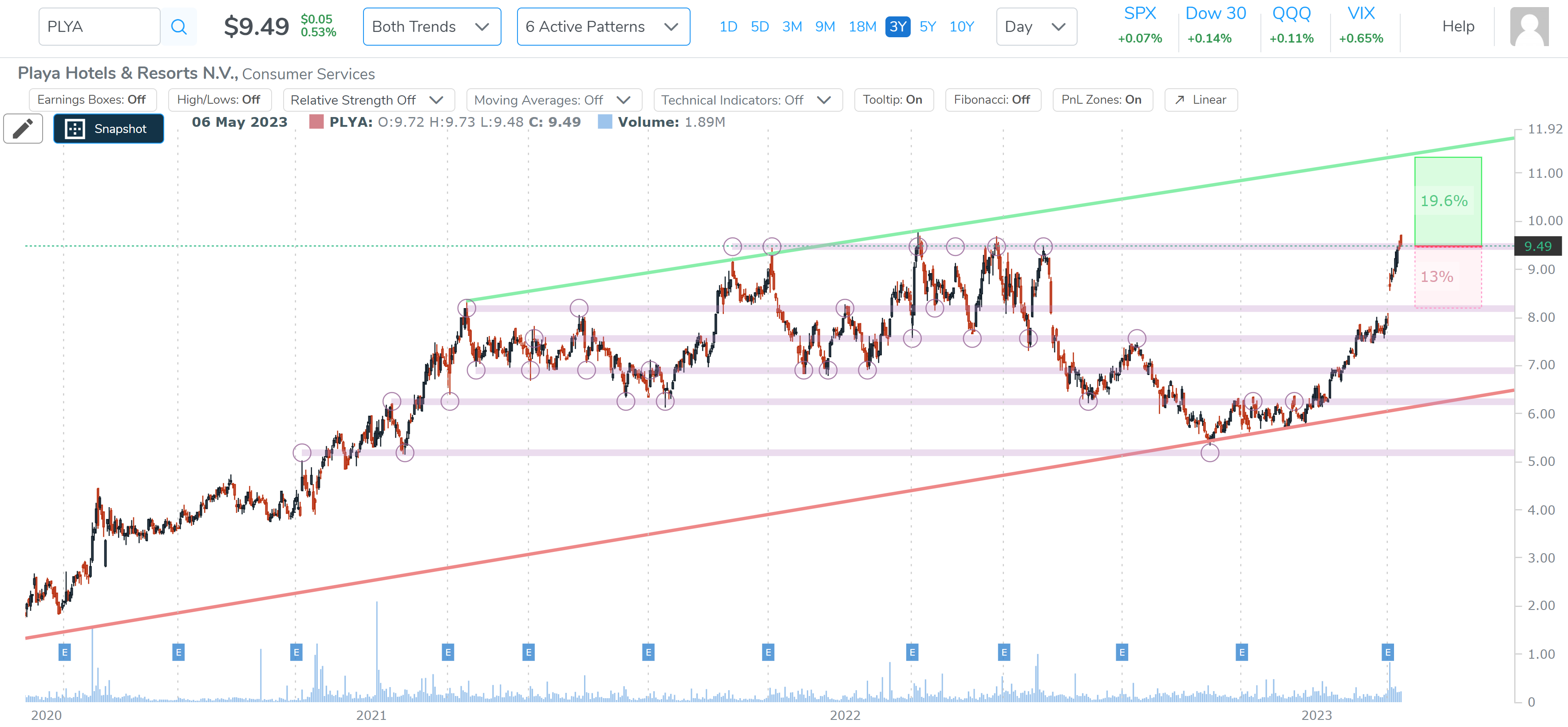
We see the uptrend that the bullish direction charts screens always give us, and we see that the stock is now right at a congestion line that has acted as a wall of resistance fully six times prior in the last two-years.
We zoom in to see the wall of resistance and the next profit zone should it break through and the downside should it fail.

The profit zone is larger than the loss zone, which is bullish, but in fairness, a trader to the upside here would be speculating on a move through and above that prior resistance. For those of you that are contrarians, a bearish speculation simply reads that prior resistance holds again.
The second ticker was KTOS. Since this comes from a multi-timeframe screen we could look at either the 3-year or 18-month charts, this time we’ll use the shorter time horizon:
It’s easy to forget (or overlook), but everything we are looking at together on this chart is now automatically generated. Prior to this upgrade I was drawing in profit and loss rectangles and guesstimating the area in each — no longer — now it’s precise and automated.

There was a long(ish) base for KTOS below $9 and it has broken out of that base and up through a multi time period congestion line at ~$12.
We now zoom in:

The loss zone would be a return to that congestion line measured as -5.5% and the upside could be to the next level congestion fully 16.4% higher.
To find more bullish charts, and bearish charts to offset a lopsided portfolio, you can check out the other directional chart screens.
A Runner?
For our final chart, we try to satisfy requests to show charts, from time to time, that may not be bullish (or bearish) per our definitions, but show a large move up on heavy volume due to earnings and through resistance.
We found it through the ‘Pattern Breakouts’ Tab and wanted two time period agreements (18 months and 3-years):

So, here you go, ticker CIEN, and the 3-year chart with everything removed other than trend support and resistance:

And we zoom in for clarity; note the pop through resistance.

We note that the stock is well off of the day highs so the ‘runner’ MOJO isn't that strong.
Alright, the rest is for later in the week!
Conclusion
If you’re not a Pattern Finder member yet, you can watch a cool seven minute minute video here and see special pricing (ending soon): Pattern Finder: The Next Era of Charting
Thanks or reading, friends.