


Bullish and Bearish Charts; Megas Caps (META, MSFT, NVDA) and More

Preface
Today we will look at bullish and bearish charts, and also pluck out two of the mega caps that reported earnings (MSFT, META) last week and one mega cap that is yet to report (NVDA).
Mega Caps
We start with the two mega caps that reported earnings; both of which had gaps up off of those earnings reports.
We turn on these settings for Pattern Finder (i.e. we click a button):
Trend Resistance (green line)
Trend Support (red line)
Congestion lines (pink lines)
Target Zones (green and red shading)
Patterns
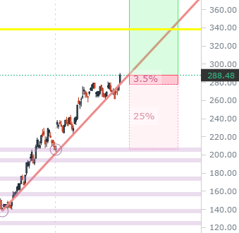
We can start with META, a stock we have discussed many times here, all in a bullish context. META has followed through with its bullish chart, and now faces a gap - it’s as simple as that - either it will or will not fill it.
Here is the 3-year chart with daily candles:
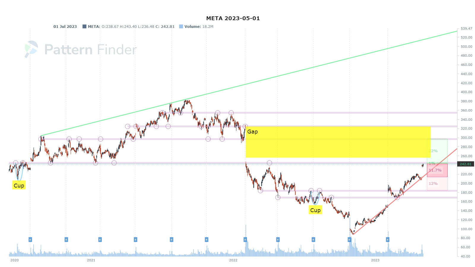
There is a large gap to be filled between $240 and $320 and META is right at that lower congestion.
We then turn to MSFT, which too reported strong earnings.
This chart shows a stock walking up support - making higher lows, whcih creates that upward sloping trend support line (red line).

Next up would be a triple top or a return to trend support. We zoom in for clarity:

And now we turn to NVDA which is yet to report earnings.
We can see the all time high would act as the next resistance at round $340 should there be a run after earnings, although the next formal support if the stock were to break below that rising low trend would be down to about $210.

Fireworks are possible on this next earnings report - one way or the other.
We zoom in for clarity:
Now we turn to bullish charts from our various screens.
Bullish Charts
We share a greatest hits chart fest from the various directional charts screen we have in Pattern Finder.
For all of these charts, note the distance to the next upside target (the green shaded area) versus the distance to the next downside target (the red shaded area).
These charts are naturally identified by Pattern Finder to have more reward:risk, or in English, the green area is larger than the read area:
The ticker is in the title of the charts. Off we go:


There are a few more, but this gives traders a bunch to chew on.
Next we turn to the contrary of these charts: the bearish directional chart screens in Pattern Finder.
Bearish Charts
In these bearish charts, focus on the size of the downside target zone (red shaded zone) versus the upside target zone (green zone).
The red should be larger than the green. Off we go:


Conclusion
You can do this yourself inside Pattern Finder; it takes about 3 seconds per chart, if that.
We are offering a huge discount and some demo videos to explain the capabilities, below.
Pattern Finder: The Next Era of Charting.
Thanks for reading.