Bullish and Bearish Charts; Profit and Loss Zones; Set-ups to Start the Week.
Lede
Today we continue to discuss charts that display opportunistic reward:risk set-ups, both on the bullish and bearish side. Our prior post discusses the context and method, so we will not repeat it here to move forward with brevity.
The prior post is below:
A 2 minute 58 second video of the screening logic is presented below as well for those interested:
Bullish Charts
We revisit the bullish multi-timeframe screen, which looks for agreement in the 18-month and 3-year charts.
We start with ticker EVH in the Commercial Sector: Evolent Health, Inc. engages in the provision of health care delivery and payment services.
Let’s start with the 3-year chart, where we ask Pattern Finder to draw in the congestions lines (pink), the trending support (red) and resistance (green) lines, and also the CANSLIM patterns (blue).
We also add the 200-day simple moving average (SMA) in red.
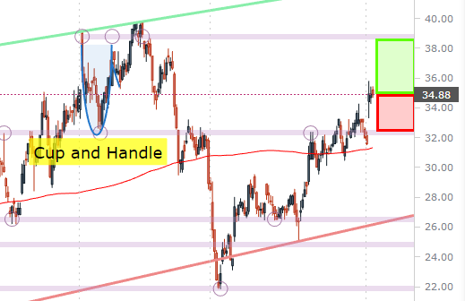
That green box to the right of the chart shows the distance to the nearest upside resistance (a congestion line in this example), and the red box signifies the distance to the nearest downside support (also a congestion line).
(This capability will also be automatically done by Pattern Finder in soon to be released new capability).
If the screen is doing what we want it to do, we should see a stock in an uptrend, where the size of the green box (upside) is larger than the size of the red box (downside), and it is.
Let’s zoom in to get a closer took.
In this case it’s easier to see that the base of the cup and handle has been selected by Pattern Finder to act as the nearest downside congestion, and the top of that cup acts as the next upside resistance.
Pattern Finder members can verify that the 18-month chart has similar characteristics for timeframe agreement.
We next to turn to a 3-year screen which does not require multi-timeframe agreement and look at ticker APG, in the Industrial Services sector: APi Group Corp. provides life safety solutions and industrial specialty services.
This is one of the more interesting screens we will be introducing this week, where from time to time we find a stock riding on the trend support line (the red line), as trend support is rising due to a series of higher lows.
The top of a cup is selected by Pattern Finder’s algorithm as the closest downside congestion and it nicely agrees with the the other algorithm - trend support.
When we zoom in, we can draw the next logical upside target, which is the prior multi-year high, and then draw in the profit and loss zones:
We’ll look at one more bullish chart, this time ticker TPX in the Consumer Durables sector. We note that January’s consumer durables orders was released today.
Tempur Sealy International, Inc. develops, manufactures, markets and distributes bedding products.
Let’s look at the 3-year chart, first.
We note that the top of a cup with handle back in 2021 is now acting as the nearest downside congestion (support) and note that a cup followed immediately by a cup and handle has led to a strong uptrend over the last several months with the stock doubling.
We can zoom in and we see more clearly that the stock has just crossed over trend resistance (the green line), so if it holds and this up trend persists, the next congestion line (pink) would be the upside target.
The 18-month chart looks almost identical, so we’ll share it for completeness. All of the markups on Pattern Finder stay unmoved as traders switch to various timeframes:
Now let’s turn to some bearish charts.
Bearish Charts
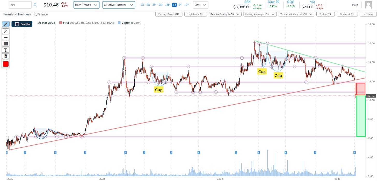
We turn to ticker FPI (again) in the Finance industry. Farmland Partners, Inc. operates as a real estate investment trust.
The stock dropped off of the last earnings report and we present the 3-year chart below.
We know the move was off of earnings by simply turning to the ‘News’ tab to the right of the chart in Pattern Finder:
Note that the base of the cup from mid 2021 formed a congestion line where the stock sat just before earnings, and the post earnings move went through it and then trending support.
This is a repeat ticker from our weekend post, but it’s an interesting enough chart to re-examine.
We can zoom in for more context:
Lastly, we will look at ticker TAC in the Utilities sector.
TransAlta Corp. engages in the generation and distribution of electricity through wind, hydro, gas and coal power plants.
This is a screen that ignores trend support and resistance, and just focuses on congestion lines. So, for these charts, we turn off those red and green lines and focus just on the link lines.
Here is the 3-year chart, and we highlight an ascending base:
Now we zoom in:
For this set-up, one could consider the bottom of the ascending base (marked by the yellow horizontal line), as first target for the profit zone, and then use the congestion line (pink) below it as a second target.
It’s all very personal, of course.
Conclusion
This was just a taste of Pattern Finder’s capability. Soon, Pattern Finder members will get these set-ups in daily emails, and there will be a “click of a button” to mark up charts as they are marked up here, along with the 10 new screens.
We invite you to discover the benefits of Pattern Finder for yourself by visiting the page below, and before the price hikes after we add substantial capabilities: Learn about Pattern Finder


