


Chart Storm - Weakness and Strength: SPX, QQQ, IWM, XLE, KRE, NVDA, META, AAPL

Lede
Today we will look at the indices, some sector ETFs, and then the mega caps.
Indices
As a reminder, all of this is done in less than 5 seconds per chart. Here is a 30 second video demonstration of that before we get started:
Everything starts with the S&P 500 and we examine it starting with the 3-year chart in SPX. We let Pattern Finder draw in the congestion lines (pink), trend support (red), trend resistance (green), CANSLIM patterns, and the distance to the nearest profit and loss zones.

We are left with the same conclusion from a week ago - a very tight range, and on the
verge of breaking through trend support.
The 5-year chart echoes this support test, but it’s also a bit more troubling for one reason: a full five-year upward channel is in risk now.

We next turn to the NASDAQ 100 through ticker QQQ. The trading range is wider than SPX, and the mega tech heavy index is right at a point of resistance.

Should it break through, there is about 10% upside to the next congestion zone, but the current spot has acted as resistance three times prior.
The QQQ chart is stronger than SPX.
Next we turn to small caps using IWM as a proxy for the Russell 2000. Of the three indices, this one is the weakest.
IWM fell below a prior double bottom and appears headed to the base of a prior cup and handle.
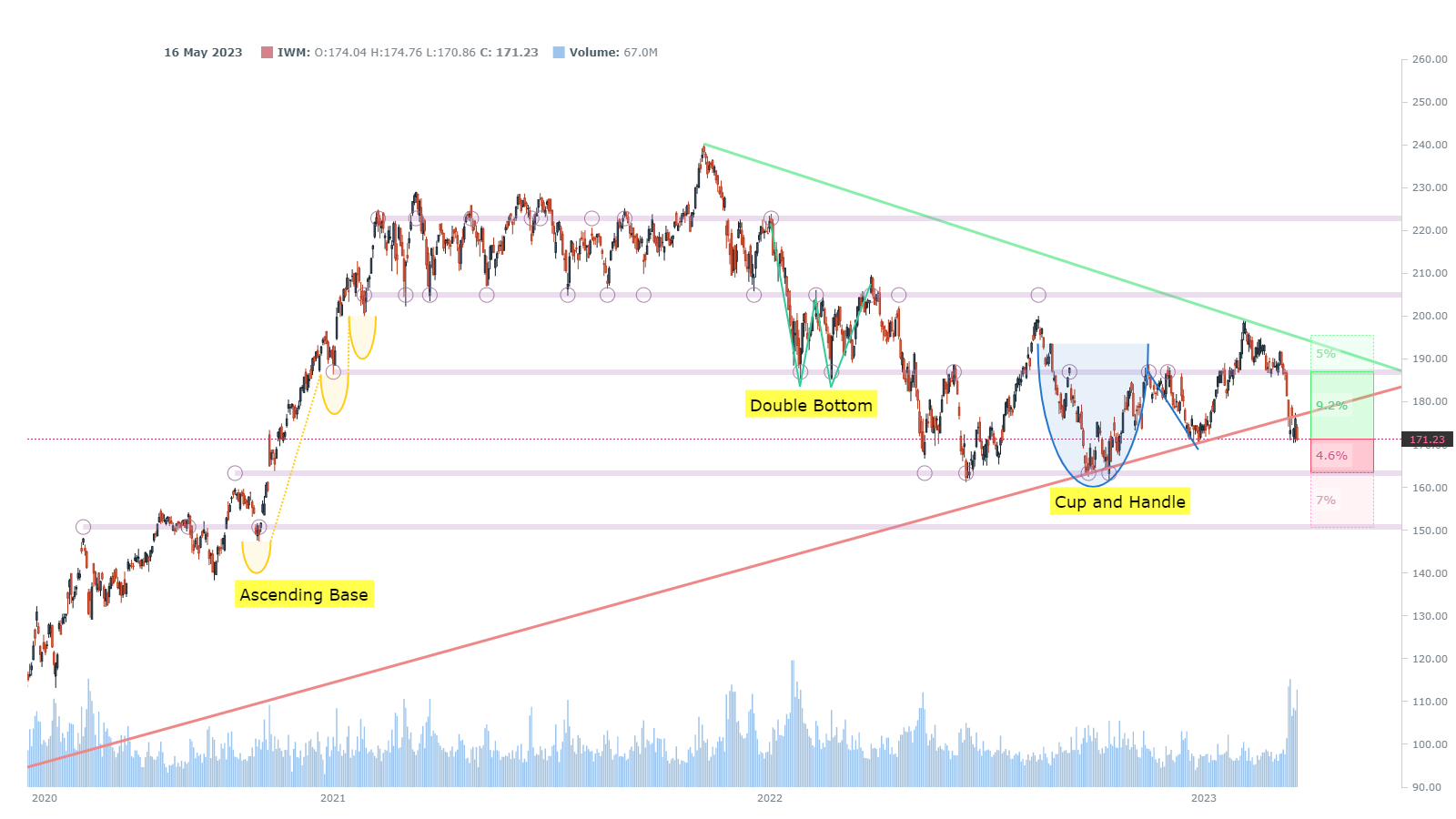
The index has violated support and needs a nice rally to return to that trend of higher lows, or there is downside ahead.
ETFs
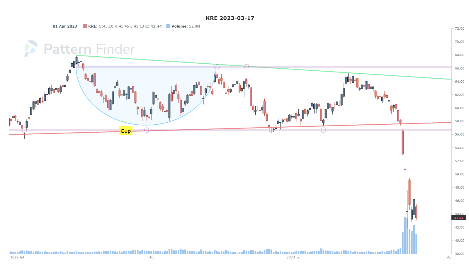
We now turn to the regional bank ETF (KRE).
This has been a rough two weeks for the regionals and every measure of support has been broken and rather abruptly:

We go to the 9-month chart and see at least the start of a possible base on heavy volume.
We then turn to energy with the XLE.
While regionals have fallen apart and energy isn’t that weak, it’s still not a chart with much strength. A precipitous drop has pushed the XLE right to support, and maybe even a bit below it:

The five-year chart has similar characteristics of the SPX - near a violation of a five-year up channel. Higher lows had been the trend; we’ll see if that gets violated.

Mega Caps
While the indices and sector ETFs look weak, some mega caps show strength. We start with NVDA. The 3-year chart shows a runaway bullish move:

That 3-year resistance will get reset if the rally holds. We can turn to the 18-month chart for a better look at the current channel:

Whether NVDA is over bought at this point is anyone’s guess, but the chart and strength are vastly different than the indices and sector ETFs we examined.
We can look at META, which also has a strong chart. META gapped down after earnings two quarters ago, rallied hard into the next earnings, gapped higher off of that, and then did a nice reset:

The stock dipped after the gap up, held that congestion line (barely), and has started a new up trend. This is one of the best chart s we see out there in tech land.
We can turn to AMZN, and a chart that looks neither overwhelmingly bullish nor bearish.
Having said that, a short-term swing trade does look like AMZN has room to trend resistance (green line). It could rally and still maintain its lower highs trajectory.

The bearish view would be that fails in this up trend where it gapped down prior and revisit that series of lower lows.
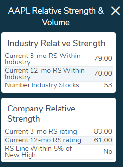
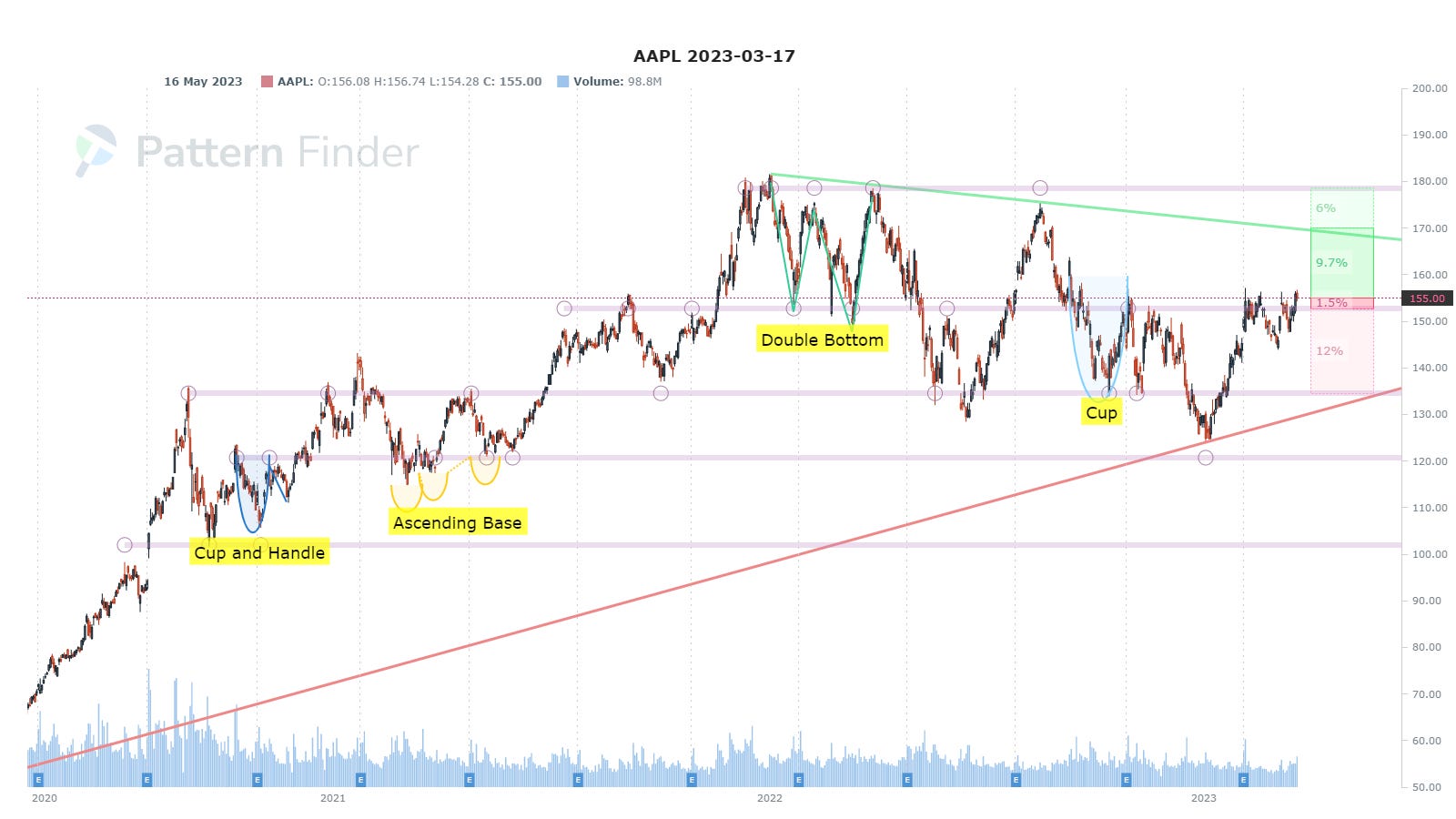
The last chart we’ll look at is AAPL. This stock too is neither particular bullish or bearish, but in this market, that actually yields a good 3-month RS (relative strength):
Here are the RS readings; we focus on the 3-month reading versus the industry and the market: 79 (out of 100) and 83 (out of 100), respectively.
And here is the chart:
Conclusion
The SPX is in a tight range and right on support. The NASDAQ 100 is stronger and the Russell 2000 is the weakest of the bunch. If traders want to look for bullish ideas in the strongest of the three - mega tech would be it.
Regional banks look woefully weak, though a base might finally be forming, and energy too looks weak.
This is a market for stock (chart) pickers and NVDA and META offer some strength, especially META with that reset of a bullish move.
Next Steps
You can do this yourself; it takes about 3 seconds per chart, if that.
Is this all done automatically with Pattern Finder? Yeah, it is.
I assure you this is simply entering a ticker, clicking the settings on, and off Pattern Finder goes.
The screens inside Pattern Finder direct you to the strongest charts (bullish or bearish), and the algorithms mark the charts up for you, turning a stock chart into a trading plan.
We are offering a huge discount, which is on the page below as well as member feedback and a great 7-minute video demo: Pattern Finder: The Next Era of Charting
Thanks for reading, friends.
You put an incredible amount of energy and innovation into this project. Although I have taken a thorough thrashing in this market the past 12+ months, I hang in there and enjoy your sites.
Ophir- I couldn't agree more with Mr. Tober's comment, I've been with CML since Oct. 2016 and enjoyed the upgrades in TradeMachine, CLM Pro and Pattern Finder as they all developed into finer and finer products. I'm wondering if you have thought about making the Pattern Finder screen more format-able so the stock chart can be made larger on laptop computers (in my case) a MacBook 13" computer?
For example- I can make the MACD thinner for a larger stock chart screen but can't either remove or make much thinner the EPS and Sales by quarter data at the bottom that would make for a larger stock screen. There is no way I can duplicate (or come close) to the stock chart clarity a larger chart would show like in your presentations.
Keep up the great work! I always enjoy your unvarnished comments during the webinars!