Chart Time - A Breakthrough with AI
Preface
Today we look at some bullish and bearish charts, and revisit two mega caps as well (AAPL and MSFT). We will include one bullish and one bearish chart from heavy volume on the day.
Some Big News
ChatGPT driven AI is coming soon to Pattern Finder and to Capital Market Laboratories (CML) in general.
We take a thrilling leap forward in AI innovation that has never been done before by unveiling a pioneering ChatGPT-driven tool for economic, financial, and stock chart data analysis, seamlessly integrated with real-time statistics.
This groundbreaking achievement unites the prowess of AI and up-to-the-minute data for the very first time.
To date, ChatGPT is extremely limited for use cases requiring current data, because ChatGPT’s “learning” is currently based on information with a hard data cutoff at September 2021.
There has been no meaningful way to effectively use ChatGPT or other powerful new AI tools for market and financial analysis.
That barrier has been broken and soon we will serve up insights unlike anything previously available, even through professional terminals that cost thousands of dollars to use. You can read more at the end of this post.
Bullish Charts
We start with one of our ten “Directional Charts” screens, specifically the “Bullish Charts; Multi-timeframe; Nearest Congestion or Trend.”
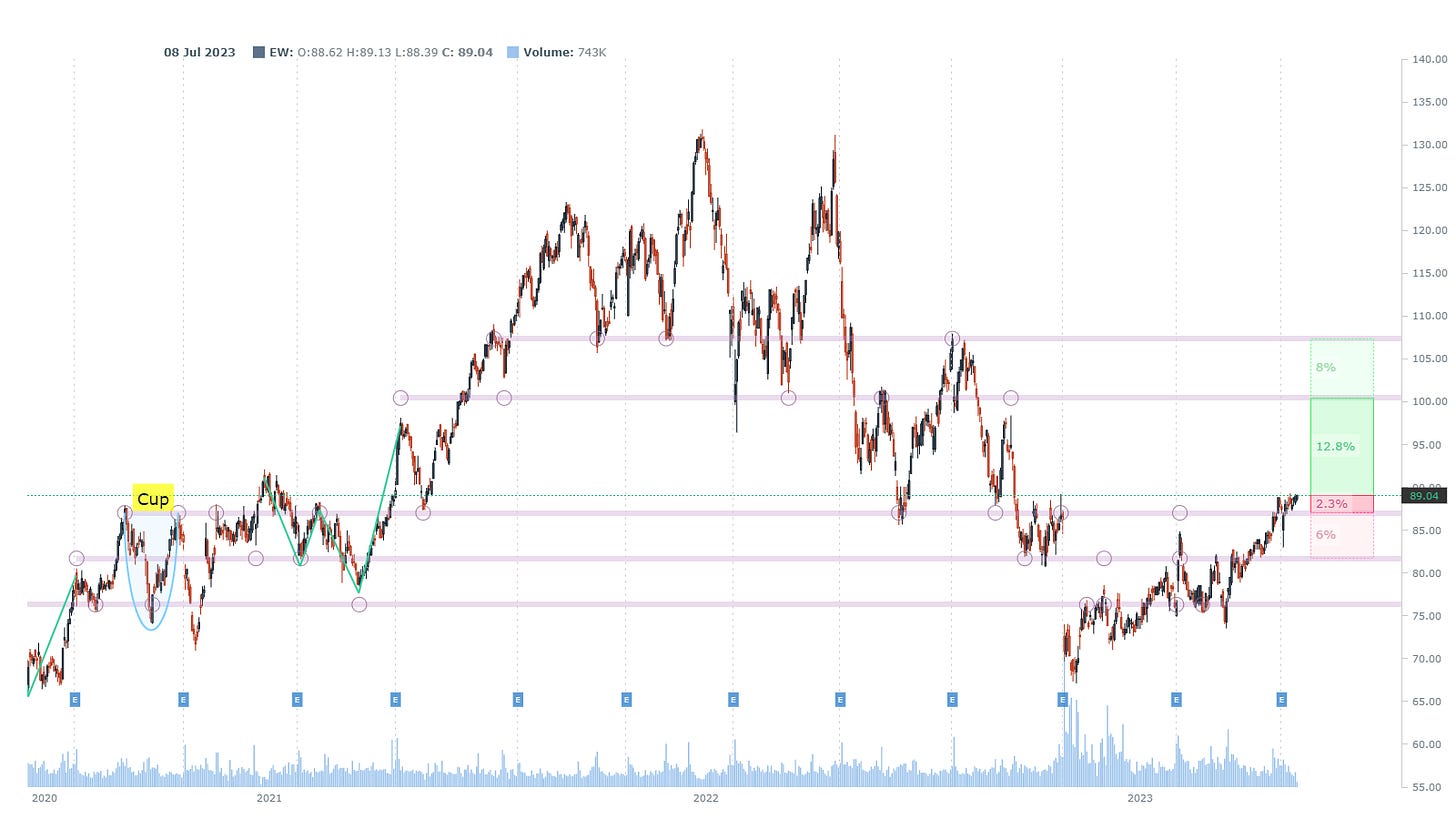
We pluck out Edwards Lifesciences Corp (EW) in the Health Technology sector.
We let Pattern Finder mark up the chart for us, specifically with congestion lines (pink), target zones (red and green shading) and CANSLIM patterns.
This stock has the looks of a possible liftoff breakout. It’s tentative without more confirmation, but all early directional charts are tentative until they aren’t.
Here is the 3-year chart with daily candles:
That’s a good looking “possible liftoff” chart and we zoom in for clarity to see the 2.3% or even an additional 6% lower in the loss zone on broken downside support but the reward zone is lager at 12.8% and even 8% higher than that.
Next we turn to DoorDash Inc (DASH) in the Technology sector.
The longer-term chart does a great job of painting the broad picture: the stock was been decimated and has now been stuck in a very tight trading range defined by the two surrounding congestion lines (pink lines).
Here is the 3-year chart:
If we zoom in we can see, maybe, a breakout from that wall of resistance. Much like the chart prior, this would require more confirmation, but… early moves come before large moves.
We next turn to a chart from the “Bullish Heavy Volume on the Day” chart: this is a real-time screen with volume extrapolated to the end of the day.
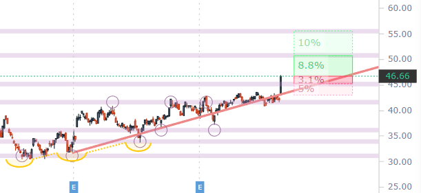
We plucked out Bentley Systems (BSY) in the Technology sector.
We ask Pattern Finder to add to the markups, this time with trend support (red line) and trend resistance (green line).
When we do that we see that trend support has been rising and that happens with a series of higher lows.
The candle today is a reaction to earnings reported this morning, and this too is a “maybe early liftoff” chart.
We zoom in for clarity:
Next we turn to two mega caps that we discussed prior.
Mega Caps
We start with Apple (AAPL) which we noted prior had a less than stellar risk to reward set-up after the earnings beat was realized.
We mark up the all time high (defined by the top congestion line in pink).
Here is the 3-year chart:
We zoom in for clarity - to define that risk to reward trade-off in the short-term. It looks toppy.
Next we turn to Microsoft (MSFT).
We noted prior, that of the two multi trillion dollar mega caps, both of which have been stretched, the MSFT chart looked a bit more promising.
Here is the 3-year chart, where the all-time high is also in play, but there’s more upside room than AAPL showed.
We zoom in for clarity:
That risk to reward is more optimistic looking than AAPL.
Next we turn to some bearish charts.
Bearish Charts
We started with the “Heavy Selling Volume” and were surprised to see large cap bank U.S. Bancorp (USB).
The regional banks get most of the attention, but here is a national bank that has been decimated as well.
We turn to the 5-year chart and note that it has fallen through any kind of support that the ascending base would have provided.
There’s no need to zoom in here - USB is at multi-year lows.
Finally we turned to the “Bearish Heavy Volume on the Day” screen an find a chip stock that has moved down off of earnings: Skyworks Solutions (SWKS) in the Electronic Technology sector.
That downward sloping resistance was set even before earnings so a series of lower highs was in play prior to earnings.
If we zoom in we can see a rather pessimistic stock for longs, or optimistic for shorts.
Conclusion
You can do this yourself inside Pattern Finder; it takes about 3 seconds per chart, if that.
We are offering a huge discount and some demo videos to explain the capabilities, below.
Pattern Finder: The Next Era of Charting.
And ChatGPT driven AI is coming soon to Pattern Finder.
We take a thrilling leap forward in AI innovation by unveiling a pioneering ChatGPT-driven tool for economic, financial, and stock chart data analysis, seamlessly integrated with real-time statistics.
This groundbreaking achievement unites the prowess of AI and up-to-the-minute data for the very first time.
To date, ChatGPT is extremely limited for use cases requiring current data, because ChatGPT’s “learning” is currently based on information with a hard data cutoff at September 2021.
There has been no meaningful way to effectively use ChatGPT or other powerful new AI tools for market and financial analysis.
That barrier has been broken and soon we will serve up insights unlike anything previously available, even through professional terminals that cost thousands of dollars to use.
The price of Pattern Finder will rise substantially once we introduce this new capability.
Please do feel free to join us:
Pattern Finder: The Next Era of Charting.
Thanks for reading and sharing is appreciated as well!


