Chart Time: Bullish Charts with Relative Strength On one Hand; Bearish Charts on the Other
Lede
Before we get charts, we must note that over the weekend the Department of the Treasury, Federal Reserve, and FDIC came together to prevent a contagion from spreading to the US banking system by guaranteeing that deposits held at U.S. banks Silicon Valley Bank and Signature Bank of NY will be made whole.
At the same time, the government will not bail out stock holders nor bond holders, and the guarantee of deposits will not use tax payer money, but rather a new short-term lending program at the Federal Reserve named the “Bank Term Funding Program.”
The program offers one-year loans to banks under easier terms than it typically provides and $25 billion is available in the program.
The Fed’s new backstop will shield U.S. banks from $300 billion of potential losses. This was able to be done because the assets in question that show losses, are in large part US treasuries and agencies, as opposed to 2008, where the debt was toxic home loans.
Preface
Today we will first look at stocks that have shown strong relative strength in the face of a recent sell-off and financial system scare.
We know full well that it will be difficult to find stocks with a great up trend in the last week. That’s alright, this time we will also make sure that the charts look at least semi-bullish too with larger profit zones than loss zones, now that we have that capability in Pattern Finder.
Then we go to several weak charts.
The Bullish Screen
We screened for companies with a relative strength (RS) in the last 3-months of 75 or greater (out of 100).
We also wanted to limit results to companies with at least $100M in revenue in the trailing twelve months (TTM), a market cap of at least $5B, a stock price of at least $10, a stock up over the last 10-days, and then our requirements for more room to the nearest upside than room to the nearest downside congestion points.
Here are the screen filters as an image:
We found OKTA and went to the 5-year chart, first. We turned on all the fixings from Pattern Finder: congestion lines (pink), trend support (red), trend resistance (green), CANSLIM patterns, and PnL zones (green and red boxes).
We can se that OKTA bounced off of trend support and has risen off of both of the last two earrnings releases which as created an uptrend.
While the stock is still technically showing lower highs and lower lows on the 5-year chart, we do have a recent uptrend and a nice set-up for a swing trade.
We zoom in:
On the 5-year chart the nearest upside congestion is 36% higher formed by the top of a cup and prior resistance before that. On the downside there is 25% room to nearest congestion.
We then moved to the 18-month chart which is far more revealing of the current stock movement: a channel between $110 and $60, with the stock at $81.
A tighter stop puts the next loss zone at 6% lower, which is easily just a bad day in the market, but still that same room to the upside.
This isn’t the best chart out there, but for tech and a stock that has risen off of earnings twice in a row, this is worth discussing.
We then turned to TCOM and the 3-year chart:
We can see that the stock has been bouncing back and forth off of resistance and back down to congestion. If the market turns positive tomorrow (that’s a pretty big “if”), maybe this stock has another round trip in it for swing traders.
We zoom in:
With the two semi-bullish charts here and the several we shared in the most recent posts, we can spend a little more time on several bearish charts, next.
Bearish Charts
A downtrend in the market gives us an opportunity to really leverage those bearish directional screens we just added to Pattern Finder.
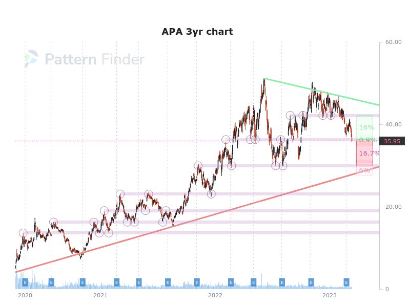
Since Substack (this newsletter platform) limits how long we can go on posts, we are going to share a series of charts with limited discussion other than to write that they all should have (i) downtrends (ii) with more room to downside support than upside resistance.
These charts (and bullish ones) are going to start coming to Pattern Finder member inboxes via email automatically every Monday (starting tomorrow).
So this is easy for me, since I have it in my inbox already. If this is working, your general reaction to these charts should be ‘oh… that’s not good.’
For these next two charts, we call this ‘walking down resistance,’ as the stocks follow the lower highs trajectory nearly linearly (walking down the green trend resistance line).
All of these mark ups on the charts have been done for us by Pattern Finder: we clicked a button and let the magic happen.
Conclusion
I’m asked fairly often about the charts we share something akin to, “is this all done automatically, or are you marking up the charts?’
I assure you this is simply entering a ticker, clicking the settings on, and off Pattern Finder goes.
As we scale into the product, we are offering a huge discount, which is on this page as well as member feedback: Pattern Finder: The Next Era of Charting
Thanks for reading, and good luck tomorrow. (Don’t forget that CPI is out Tuesday, and PPI is out Wednesday.)


