Preface
Today we’ll look more deeply into the mega caps and their charts, with all having already reported earnings.
Mega Cap Charts
For all of these charts we let Pattern Finder draw in the following:
Trend resistance (green line)
Trend support (red line)
Congestion (pink lines)
Target Zones (upside and downside as shaded zones)
CANSLIM Patterns
We start with AAPL which just reported earnings Thursday and raised guidance.
The stock has been on an up trend, and looks to be headed to a test of that all-time high. Here is the 5-year chart:
And we zoom in for clarity:
The chart reads that upside to the all-time high may follow through but above that would take quite the volume. It looks toppy.
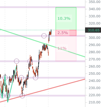
Next we turn to MSFT and on the 5-year chart it is actually through resistance, forming a new trend should it hold these levels.
We can see that MSFT popped off of earnings, and in this case, unlike AAPL, if it does test the all-time high, it has a favorable risk-to-reward, with about 10% to the high and support formed at nearest congestion maybe 2.5% lower.
We zoom in clarity and see the possible risk to reward set-up:
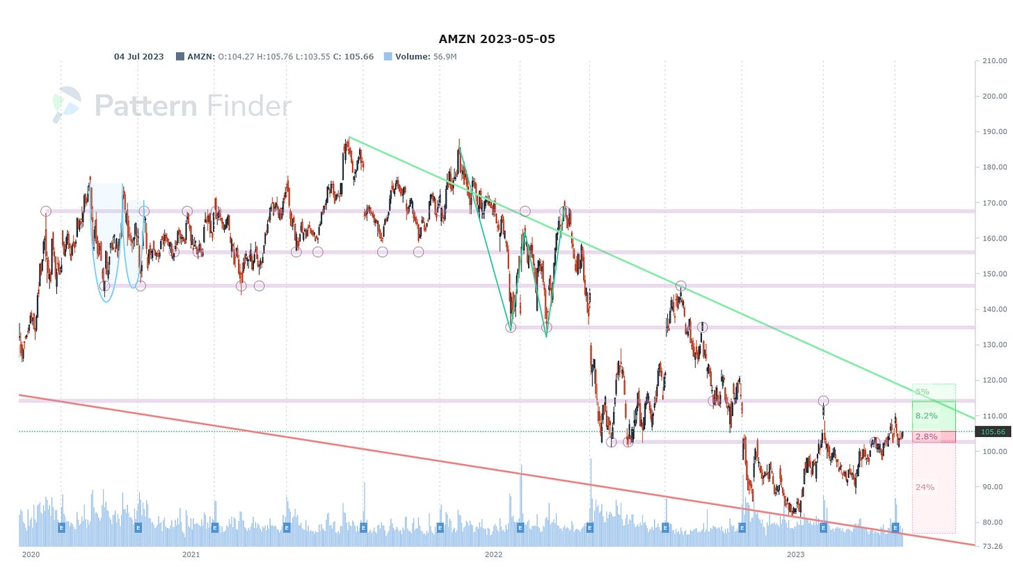
Next we turn to AMZN. We can see a failed breakout off of earnings and a stock very much stuck in a trading range.
We zoom in and see that for a trader with a quick exit, there is a bit of a risk to reward benefit:
Now we turn to GOOGL.
Of all the charts, GOOGL is the one with weakest signal, not bearish, just indecisive; the chart very much reads as a coin flip right here.
The stock is on top of a congestion line which itself was formed by a quadruple bottom an then a triple top.
We zoom in for clarity; focus on the little circles on the pink line in the past and you will see the quadruple bottom and then a triple top following it.
We can turn to META next.
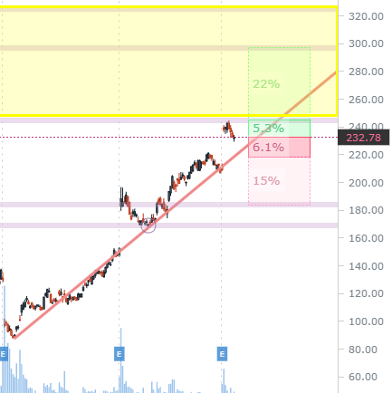
We have been writing a fair amount about META as it walked up support but now it is right at the bottom of a prior gap and it will take quite the push to get it above:
We can zoom in, noting that the yellow highlighted area is the gap, and that the stock was rejected at the congestion line and may head down to trend support:
Finally, we turn to TSLA.
TSLA is in no man’s land, much like GOOGL, but this time with a recent down trend.
That downtrend is most easily seen by a trader through the downward sloping trend resistance line (the green line) reflecting a series of lower highs.
We can zoom in and see the down trend and the gravity that was building to the current congestion line.
Even though the headlines read about the megas and how they are driving the indices higher on Friday, we see far more more interesting (bullish and bearish) charts in non mega caps.
Pattern Finder members, check out the “Directional Charts” set of screens, and right at the top you’ll find 11 bullish charts.
Alright, that’s it for today.
Conclusion
You can do this yourself inside Pattern Finder; it takes about 3 seconds per chart, if that.
We are offering a huge discount and some demo videos to explain the capabilities, below.
Pattern Finder: The Next Era of Charting.
Thanks for reading and have a fabulous weekend.


Great help!