Charting the S&P 500; Next Key Levels
Lede
Today we focus on the SPX rather than do our standard screening for volume, relative strength, and buying or selling strength.
We find that the index is nearing congestion, but has room to 4200, while it has short-term support at 4000, longer-term support well below that level.
Charting the SPX
Our methodology involves analyzing points of congestion, support, and resistance using a combination of long-term, medium-term, and short-term charts, in order to identify consistency across different timeframes.
Let’s start with the 10-year chart, using weekly candles. We allow Pattern Finder to draw in the following:
(i) trend support (red line)
(ii) trend resistance (green line)
(iii) congestion lines (pink lines)
(iv) CANSLIM patterns
We see rather quickly that the next point of resistance would be congestion at about 4200 (remember that number), formed by multiple lows and highs and starting at the end of an ascending base:
Let’s zoom in.
We use longer-term charts for longer-term trade setups and in this case the chart reads that there is more room to resistance (~4200) than support (~3600).
But we are more interested in shorter time frames, so we next turn to the 5-year chart, also using weekly candles.
The picture in the intermediate-term chart shows the same resistance, so we have agreement across time zones, but trending support off of the COVID low is tighter (higher).
We still have an ascending base that ends at the same spot, but is far less shallow (starts at 3600 as opposed to 3200 in the 10-year chart).
We can zoom in:
The trading zone in this chart goes from trending support (red line) to the same congestion line (and fortified by the same end point of an ascending base). Risk to reward here is better, but still leans slightly to more downside than upside.
Finally, we turn to the 18-month chart, using daily candles.
This time, again, resistance is drawn at 4200, and that gives us agreement over all three time periods. If you’re a user of charts, then 4200 is a critical level, irrespective of time frame.
The near-term support is actually closer to 4000.
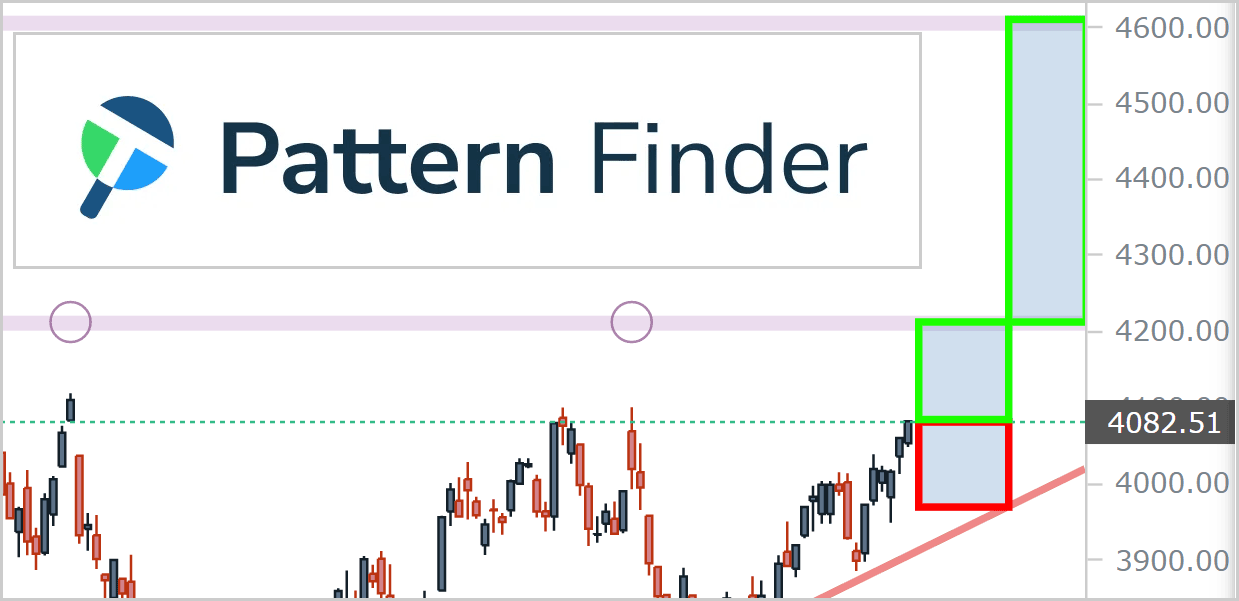
We have drawn the distance to support with a red rectangle and the distance to resistance with a green rectangle, and in the very short-term, upside space is slightly larger than downside space.
Let’s zoom in for our last look.
We draw in a final profit zone if there is a breakthrough the 4200 level (the level confirmed as resistance on all three timeframes).
A rip through 4200 could point to a move to 4600, next. But, first things first.
As an aside, while we did this exercise with an index, it’s the same approach we take with individual stocks as well.
Conclusion
There is apprehension that the market's recent surge may have exceeded its natural bounds and been spurred by a flawed comprehension (or illusory optimism) of the Federal Reserve's prospective actions in the impending year of 2023… but it's all probabilities.
Successful traders understand the importance of staying informed about market rumors, macroeconomic forecasts, inflation, and other factors that can affect trading outcomes.
These are all reflected in a stock chart.
However, sifting through this vast amount of information can be a daunting and time-consuming task, which is why we at Capital Market Laboratories have developed a revolutionary tool: Pattern Finder.
With Pattern Finder, we empower traders to take control of their investments by simplifying the process of understanding stock charts and screening for profitable trades. This innovative technology transforms a standard stock chart into a comprehensive trading plan in mere seconds, eliminating the guesswork and saving valuable time.
We are thrilled to see that our members are finding success with Pattern Finder, and we are committed to providing ongoing support and resources through our platform and trading community.
We invite you to discover the benefits of Pattern Finder for yourself by visiting our website to learn more: Learn about Pattern Finder
Thank you for your continued support and trust.


