

FOMC Day - Where to Look if it's Good News or Bad News - Finding Strength


Lede
Today we use Pattern Finder to find strength in areas that have done well in the inflationary environment when the Fed has been tightening, and we will do the same for companies that would have a better chance to rally on a more dovish Fed.
We’re not here to predict the Fed, we’re here to prepare for any eventuality.
Also, a reminder that today is the last day for the early bird pricing for Pattern Finder. The price rises tomorrow.
Preface
Readers have requested that we do more videos, and so oblige today with a video post, while including some of the major points in the written word.
Remember, you can do any and all that we do on this substack by using Pattern Finder yourself.
You can learn more about the platform and the special (and limited) reduced price since it was just released a week ago here:
Learn About Pattern Finder - Exclusive Price
For those that prefer a video, here you go:
For those that prefer the written word, you’ve got that below:
A Hawkish FOMC - Strength - Regional Banks
We ran this screen for regional banks:

This resulted in just 10 companies, and we chose the largest market cap: ticker BAP.
We will follow the methodology introduced on the recent webinar “Why and How to use Stock Charts to Trade.”
We start with the long-term chart: 10-year using weekly candles:

With no red flags and after we have drawn in the profit zone, loss zone, and a horizontal indicator for the 50-week SMA, we move on to the medium-term chart: 3-years using daily candles:
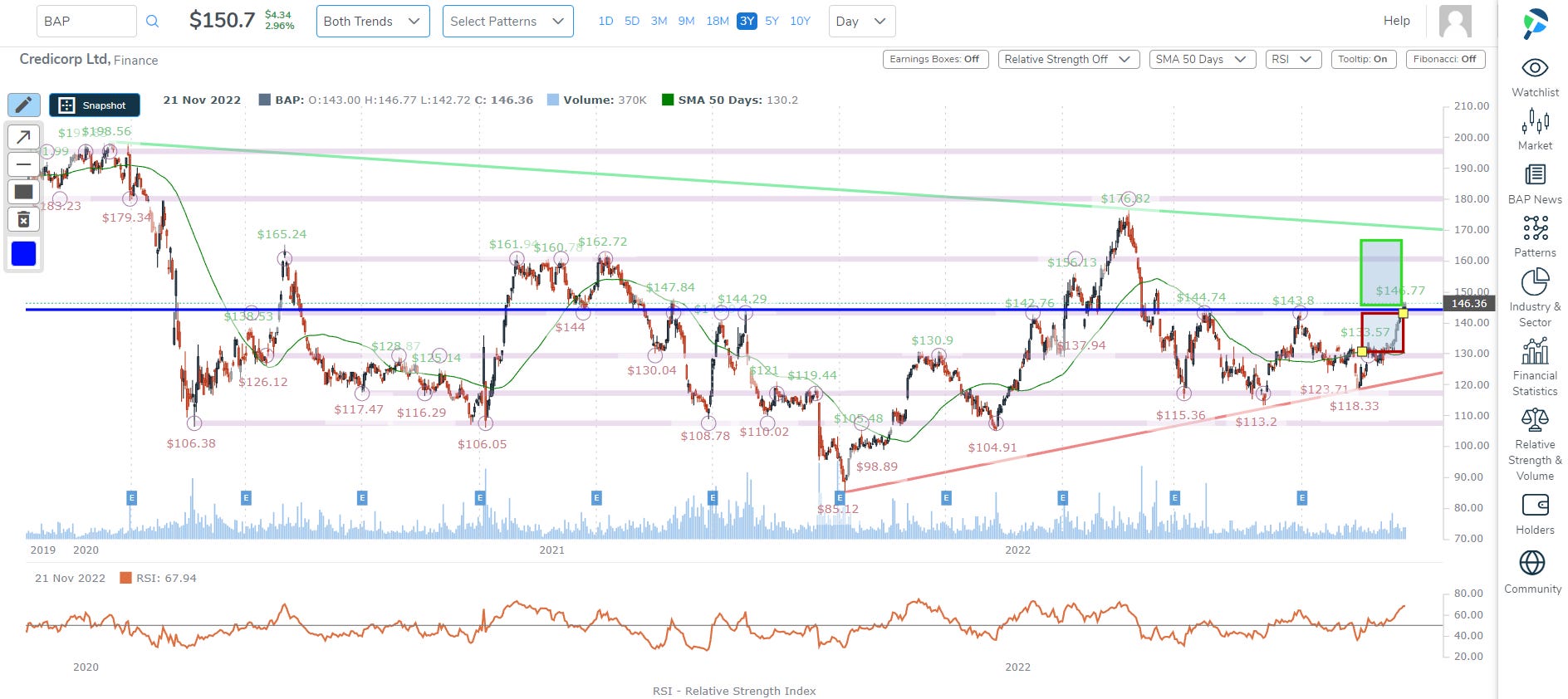
Again, there are no obvious red flags in this medium-term chart which allows to move yet more forward to the short-term chart: the 18-month chart using daily candles:

We note a similar conclusion: clearly defined up trend with trend support on the 50-week SMA as the loss zone and trend resistance from the 10- or 3-year charts as the profit zone.
That’s for a hawkish FOMC and could well fall on its face if the Fed is perceived to be dovish. Now we move to the opposite possibility.
A Dovish FOMC - Strength - Technology
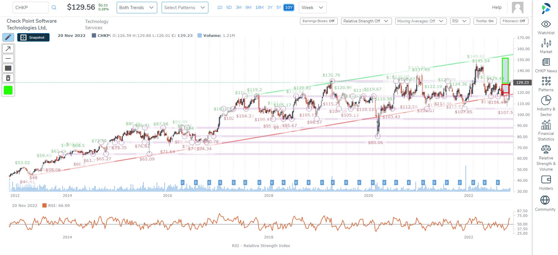
We ran a similar screen, but swapped in a different sector (Technology Services).

This time, out of 10 companies, we plucked the one that had the largest one-year stock return: ticker CHKP.
Again, we follow the same methodology: the long-term chart - 10-year using weekly candles:
We drew in our profit and loss zones and Pattern Finder did the work for us automatically drawing in trend support, resistance, and congestion.
With no red flags, we went to the medium-term: 3-year chart using daily candles.

We come to a similar conclusion but do note the congestion line right at the current price (~$130) which has been reinforced 11 different times in the prior 3-years. That makes it non-trivial resistance.
Then we turn to the short-term chart: 18-months using daily candles.

This time that congestion we noted in the 3-year chart has been identified by Pattern Finder as not just congestion, but in fact the enforced short-term resistance trend.
The large move recently came off of an earnings release. If CHKP can move above that $130 level on heavy volume in response to a perceived dovish FOMC, that could be the trigger.
That’s for a dovish FOMC and could well fall on its face if the Fed is perceived to be hawkish.
Conclusion
Patten Finder is a charting and technical platform with robust screening for fundamentals, growth, RS, buying intensity, volume, and a much more (incusing all of the CANSLIM patterns, like cups, cups with handles, ascending bases, and the rest).
You can learn more on the page below, which includes two short videos (one for patterns and one for screening) and a very large discount that will no longer be available after tomorrow.
Thanks for reading, friends.