


S&P 500 - Automatic Adjustment to Support Just Occurred in Real-time; Why it Matters


Lede
Yesterday we posted SPX Before the Fed - Critical Levels and noted that the 5- and 3-year charts, as well as the 18-month chart all pointed to the fact that right before the Fed decision and press conference, well, as the title reads, the index was at “critical levels.”
We did not (or could not) anticipate what happened next.
Algorithm Identifies New Trend - Raises Probability of Down Trend
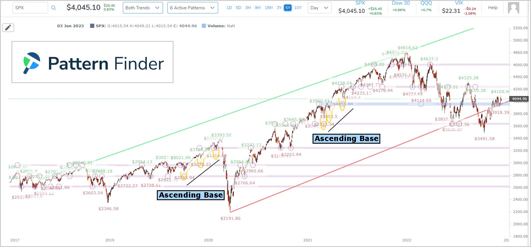
The 5-year chart for the SPX from yesterday’s post, which was before the market reaction to the Fed decision, looked like this:
We wrote the following (yesterday):
Pattern Finder automatically draws in the ascending bases (two of them), the congestion lines (pink lines) which act as short term support and resistance, and finally both trending support (red line) and trending resistance (green line).
The index is right at support and… right at the same price where an ascending base ended.
We also shared a zoomed in chart:

And then we wrote:
The support level is clear and the Fed holds the keys to car that will drive the index.
Today the SPX is down ~2.6% as of the chart capture and more than 3% at the time of publication, and we got a surprise.
SPX 5-year support has changed - it's entirely algorithmic, there is no human input, there is no bias. This is a signal of heightened risk to the downside right now.
This is strictly an algorithm which takes all of the data of the prior 6-years (the length of the chart plus an additional year) into account and draws the most relevant support (and resistance).
This is today's 5-year SPX chart, and we have drawn in where support was as of just yesterday (presented above) for convenience.

The grey line was trending support from yesterday, while the red line is today.
The market move off of the Fed decision and press conference has influenced Pattern Finder to draw SPX support lower -- that's the corollary to an analyst saying they have lowered the bottom range for SPX forecasts (it's all probabilities).
But this is objective, as opposed to an analyst which is highly subjective.
Remember, Pattern Finder (and charting in general) does not make predictions, it handicaps probabilities and today it reads that the probability of SPX going lower are larger than they were yesterday.
With a lower support, whatever the probability of a lower SPX was prior, today the odds of a lower SPX are higher — not a prediction, just a purely algorithmic analysis of odds.
We can zoom into the chart from today:

Support went from about the 4,000 level to the 3,600 level.
The various weightings inside the algorithm have now identified that low of 3,491.58 as a support point as opposed to prior, where it was treated as a short-term low that was not worthy of defining a support line.
As for the detail, sure, here you go:

That pink shaded area (the area below the prior support line) became too large once the index dropped today, causing the penalty to the prior support line to become too large to sustain, and the algorithm chose the line lower, to offset that penalty.
Any numeric algorithm that is informed by weights will have a moment where one side over takes the other and a change is made.
That change was satisfied today with the drop in the SPX off of the Fed news and it was automatically done for us with Pattern Finder. Yeah, we’re not like the other charting systems.
It’s not just a sales pitch (OK, it’s a little bit of a sale pitch, but it’s also absolutely true and we are not afraid to expose how our algorithms work so you can benefit).
Learn more about Pattern Finder here.
Which Stocks Rose on the News
As promised yesterday, today we will look at which stocks rose and feel on the news, using one the pre-defined screens in Pattern Finder:

That screen has the following requirements:

In particular it requires stocks to have at least 3.5x as much volume today versus the 30-day average while also being up on the day.
Here are the three that qualified:
Note that they are all micro caps (market caps below $1 billion).
We do the same for the bearish daily volume screen:
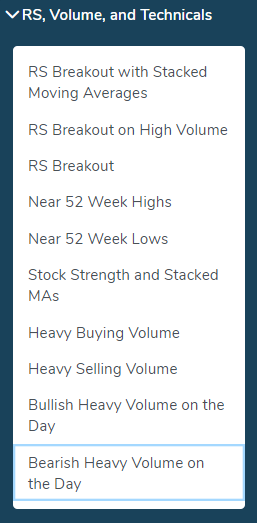
Here are those few results:

With just ten companies qualifying for the bullish (3) and bearish (7) screens, what we can say is that volume simply isn’t overwhelming, today.
Sector and Industry Strength
Backing out to a one-week view, we can see which sectors have done the best (and worst) using the ‘Sector & Industry Strength’ tab in Pattern Finder.

And then the worst performers:

So, we see strength in Energy Minerals (like oil), Transportation, and Finance (like banks) and weakness in Retail Trade, Tech, and Non Energy Minerals (like Steel and Aluminum).
Pattern Finder members can dive into each sector to the industry level, and then to the stock level.
Here is an example that goes from the Energy Minerals Sector to the Oil Refining or Marketing Industry, to the best performer, PBF Energy Inc (PBF):

The stock bounced off of support and is through the prior high of a cup. We’ll leave the rest to you!
Conclusion
We truly hope you are enjoying using Pattern Finder and our posts and see how easy it is to improve your trading. It’s better than anything else out there (in our opinion), and we continue to demonstrate why.
See Pattern Finder in action, below, before the price hike in Jan 2023.:
Thanks for reading, friends.