


Set Ups for Tomorrow's 'Super Bowl' of Economic Data: META, AAPL, TSLA and Small Caps

Lede
Tomorrow is a big day for economic data so we look at charts that are the verge of breaking out to the upside or breaking down to the downside.
This post, by construct, looks at the riskier side of things and speculating on economic data is not appropriate for many traders. Each chart could evoke a sort of ‘oo, that’s on the edge there; feels risky.’
Preface
We write a newsletter entitled ‘Daily Economics’ and readers can reference that to gain more context on the economic data due out on Friday.
For now, we accept it as likely market moving and look for stocks on the precipice of breakouts or breakdowns. We use some large companies as well as smaller ones.
Precipice of Bullish Breakouts
We will allow Pattern Finder to draw in the following for every chart we look at and we note that I have done no manual work on these charts other than label some patterns. This is ‘pick a ticker’ —> ‘hit go.’
Trend support and resistance
Intermediate congestion lines
Target upside and downside moves and risk
CANSLIM patterns (cups, cups with handles, ascending bases, etc.)
Let’s start with META and three year chart. Note that the stock is sitting right on congestion after filling a gap - exactly a ‘precipice’ we are after today.

The current congestion line is built by a recent cup and the upside target is formed by another cup in 2020.
We zoom in:

For those in the bullish camp on macro data tomorrow, META has 26.6% room to next congestion in the intermediate-term (not a one day move). The risk is a poor market reaction to economic data and then there is a gap to be filled.
We can turn to AAPL and the 18-month chart. We choose it due to its appearance on the ‘Pattern Breakouts’ tab:

Here is the chart, and we note the price is right at (i) congestion set by a double bottom (ii) congestion set by a cup and (iii) trend resistance formed lower highs:

We zoom in:

A bullish trader here has the opportunity for a breakout through resistance and about 15% higher to $180. We note that Goldman Sachs just put out a $199 price target for AAPL (whether that matters or not is your call).
Now we turn to a smaller company from one of our five directional bullish charts screen: NTRA.
Again, the charts we examine today are intentionally on the edge of a move - these charts should feel risky.

NTRA is right at congestion, and barely snuck above. We zoom in to see the zones:

If good economic data pushes the market higher, NTRA has room in the short- and intermediate-term. The contra position is also true.
Now to bearish charts:
Precipice of Bearish Breakdowns
Now we look to the bearish set-ups, which too will (probably) only be realized if there is a negative reaction to economic data.
We start with TSLA - a stock with a recent downtrend and a lot of room to the downside.
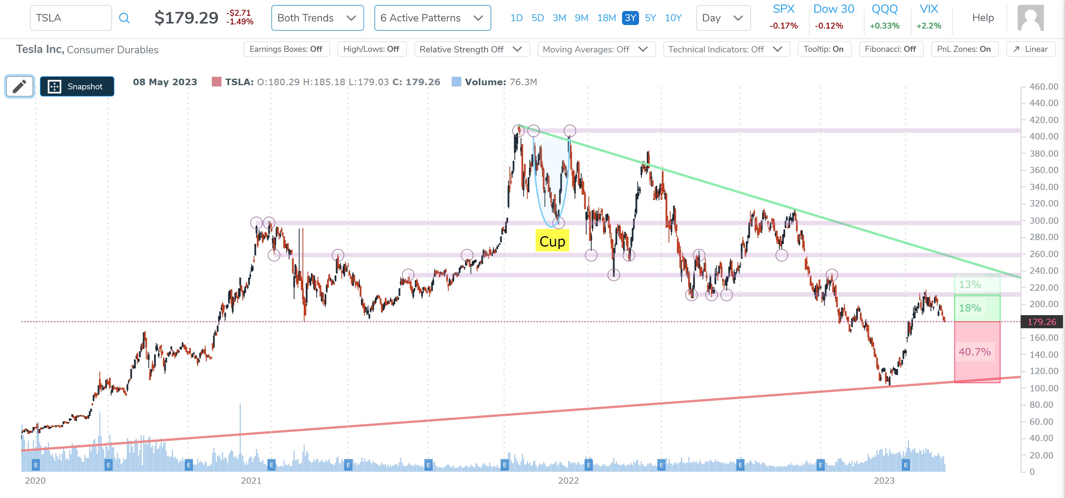
A reversal sees the next upside congestion at about 18% higher, but a continuation of the downtrend sees a lot of room below the current price in the intermediate-term.
A shorter time frame window shows a tighter range, but a similar set up. Here we zoom in on the 18-month chart for TSLA:

A bearish trader here could target a 15.5% downside move in the short- to intermediate-term, but as with all the charts, this is a macro driven move in the next day, likely.
We next turn to a smaller company from one of our five bearish directional chart screens, and get ticker CMP.
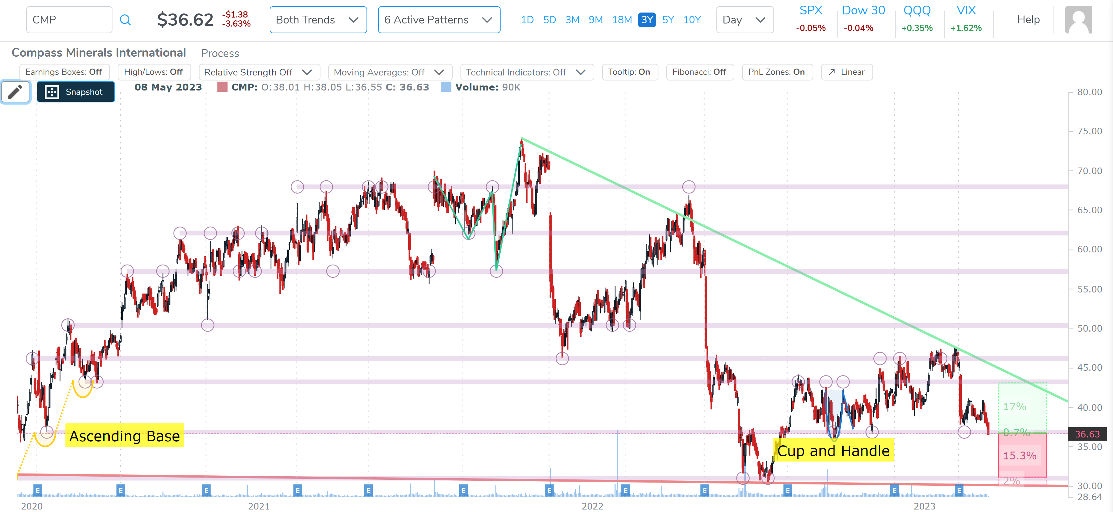
The screen looks for downtrends, and we have one. The stock is right at, and even below, congestion formed by an ascending base in 2020 and a recent cup and handle.
Let’s zoom in:

As we noted, economic data will lead the day tomorrow, but this chart is weak the downside is palpable.
Substack, this newsletter platform, limits the size of posts, so we share just one more bearish chart, but note that there are a nice number of setups on both sides of the tape right now. An unsure market makes for good set-ups to both sides.
We look at CFLD and the three-year chart and, again, the screen guarantees us a current downtrend, and this one is abrupt.
The stock is through trend support, through congestion formed by a cup, and looks quite weak. We zoom in:

Could the stock turn around on good economic news? Yeah, of course it can. Are the probabilities skewed to the downside? The chart reads ‘yes.’
Conclusion
I’m asked fairly often about the charts we share something akin to, “is this all done automatically, or are you marking up the charts?’
I assure you this is simply entering a ticker, clicking the settings on, and off Pattern Finder goes.
Truly, in less than 10 seconds, an entire trading plan shows up on the charts and the screens get traders to the specific trends they are after, like increasing relative strength, or up trends, downtrends, compounded charts (several requirements), and a magnificent fundamental screening library.
There is a short video on the page below about 1/3 of the way down the page to demonstrate it.
As we scale into the product, we are offering a huge discount, which is on this page as well as member feedback: Pattern Finder: The Next Era of Charting
Thanks for reading, and good luck tomorrow.