

SPX Trading Range Defined; A Surprise Upgrade... Profit and Loss Zones; Bullish and Bearish Charts
SPX Trading Range Defined; A Surprise Upgrade... Profit and Loss Zones; Bullish and Bearish Charts
Weekend Reading Made Fun Again

Lede
For our Friday evening post we’re going to add some pizazz to your weekend.
We will start with a look at the indices - namely the SPX, then look at some bullish charts and bearish charts.
Ah, but that’s not the pizazz; this is:
This post makes use of what will soon be the next major upgrade to Pattern Finder — automatically drawn and labeled profit and loss zones - as they are currently presented in our internal development environment.
Indices
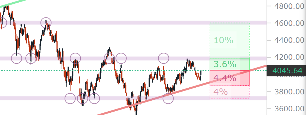
We start with S&P 500 through ticker SPX and a five-year chart.
We let Pattern Finder draw in the congestion lines (pink), trend support (red) trend resistance (green), and CANSLIM patterns.
We label the two ascending bases and we shaded the current trading zone (the area between the nearest congestion lines) in light blue.

We can see that as bullish as today felt, the SPX is very much in a trading zone between those congestion lines. But, how do we define ‘tight’ trading zone? Who draws in that blue fill?
Now, we turn to new functionality in Pattern Finder that will be released within a week. We have turned on profit and loss zones, and then zoomed into the chart to put hard numbers to our claim that the trading zone is tight.
The first profit zone would be to the next closest congestion line and is only 3.6% higher. Similarly, the first loss zone is to trend support (the red line) and is only 4.4% lower. These zones are drawn by Pattern Finder automatically, we did nothing here other than click a button:
That’s about as tight of a trading zone as you will find and it screams range bound. It’s also drawn automatically for you, so you can quantify it… exactly.
The second profit zone would be to the next highest congestion line, and that shows 10% upside above and beyond the first 3.6% prior upside. The second loss zone is another 4% lower beyond the first 4.4% loss zone.
Again, these are tight trading zones and for now, SPX remains range bound.
With this view of the market and a new functionality in hand, we turn to some bullish and bearish charts.
Bullish Charts
Now we repeat the goal of the newly released bullish and bearish chart screens (10 of them), but this time the words will ring even truer with the retrospect of what a tight trading range looks like in SPX (above) and what a bullish trading zone looks like, right… now.
We went to one of our directional chart screens:
We plucked out ticker STLA. Here is the 5-year chart, and this time we turned on profit and loss zones:

Now we see a very different trading zone than the SPX.
We can zoom in and for purposes of clarity, we draw in the up trend in a purple line. Again, that uptrend is guaranteed by the screen, as is the profit and loss zone construct:

We see a tight trading zone to the down side of just 3.6% lower and a second lower loss zone 6% below that. But to the upside we see a profit zone fully 15.2% higher, and a second extended profit zone of another 8% higher.
That’s what a bullish chart looks like - more room to the nearest upside than downside combined with a prior uptrend, and those two requirements are guaranteed when using the directional chart screens.
Now that is a satisfying chart, made so not just by the screen, but by the simplicity of Pattern Finder’s markups. And while chart and technical trading is about probabilities, this could help them skew in our favor.
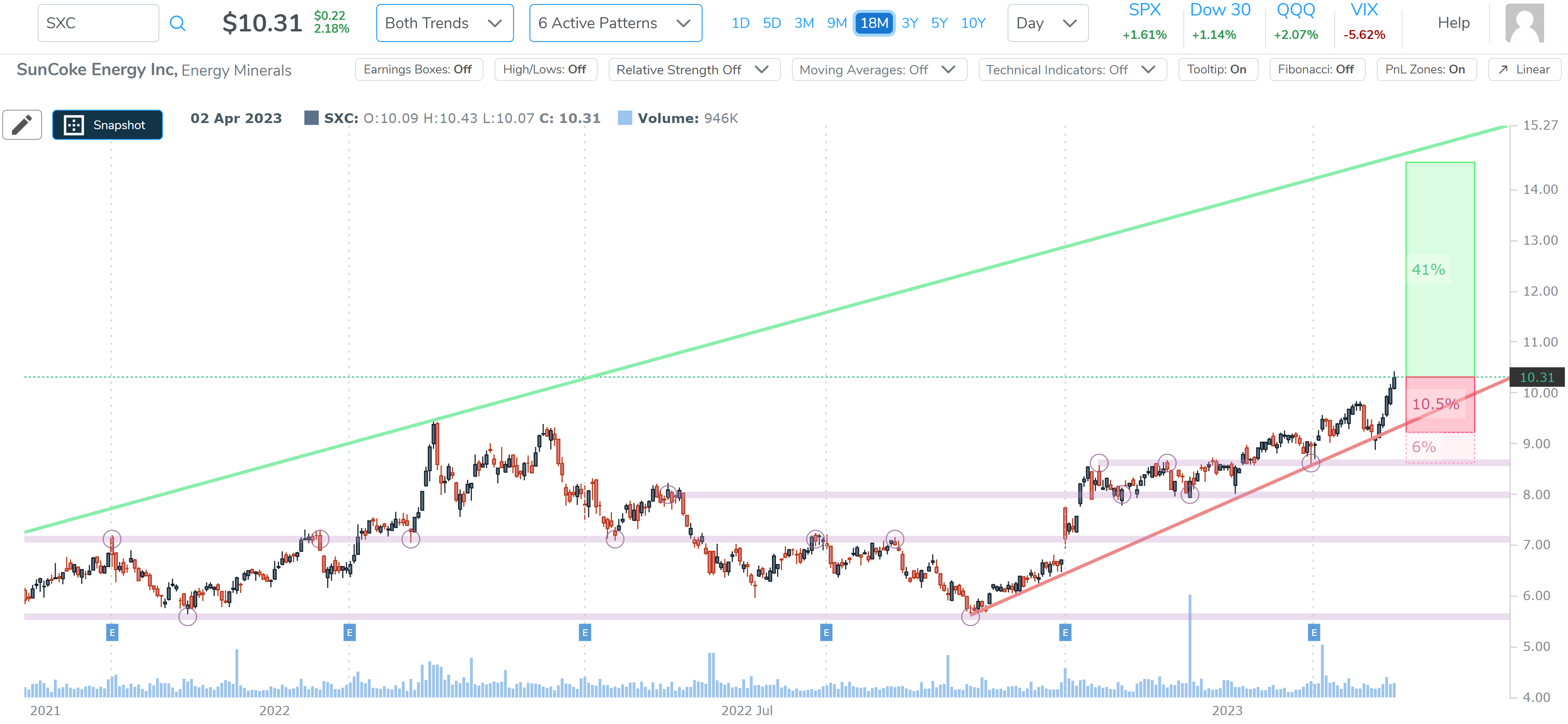
Let’s do the same thing and look at ticker SXC.
First we start with the 18-month chart. Note the (i) up trend and the (ii) greater distance to the upside than the downside. We also note that this is one of our favorite set-ups, where the stock is making higher lows and the price is walking up that trend support line.
We then move to the 3-year chart:
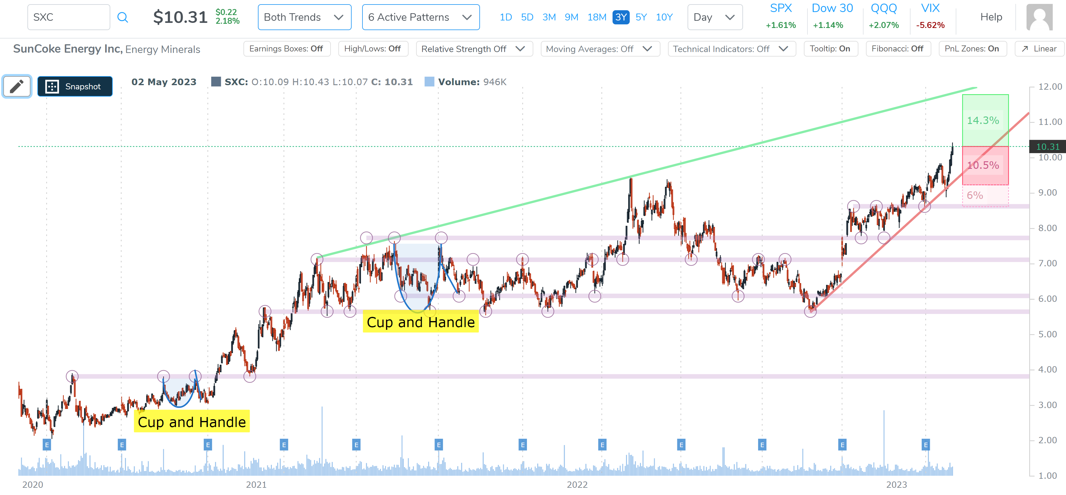
We have the uptrend we wanted, and we have more room to the next profit zone (14.3%) relative to the next downside congestion (that acts as a loss zone) at -10.5%.
We can zoom in for final clarity:

We could list more bullish charts, but what fun would that be? Go ahead and have a look under the new directional screens, knowing full well that the profit and loss zone identifications will be there within a week.
Bearish Charts
We can look at a bearish chart as well, and this time we’ll use a different breakout approach: Pattern Breakouts.
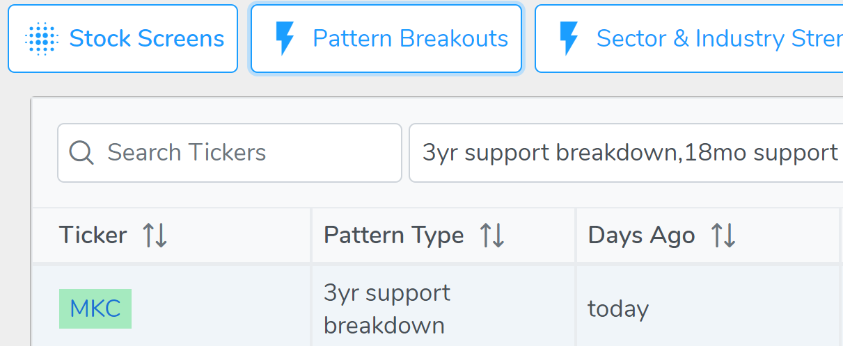
We turned to a stock which broke through 3 year resistance today, as the market rose. We look at ticker MKC.
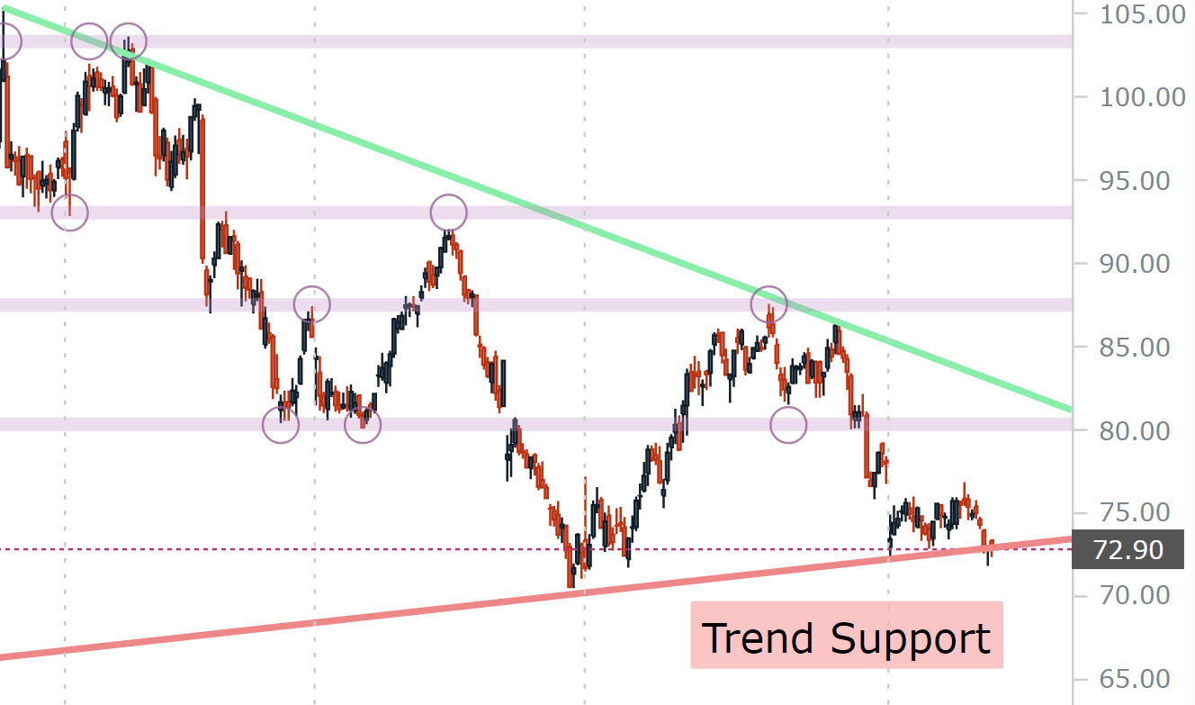
Here is the 3-year chart

We note that trend resistance (green line) is falling on lower highs, but trend support (red line) was rising on higher lows. But today, the stock crossed below that support.
We zoom in to see the trend more clearly and we do note that the breech could be called superficial as of now, but it’s on the radar for sure.
Lastly, we used one of our new bearish directional chart screens introduced this week and found ticker CBNK.
We start with the 3-year chart, and as always, we let Pattern Finder draw in the congestion lines, trend support, trend resistance, and the CANSLIM patterns.
This time we also turn on the automatic profit and loss zones (coming to Pattern Finder within a week).
Since this is from one of our directional bearish charts, the downtrend in the chart is a requirement:

We can see the distance to the nearest upside congestion is 4% (that would be the loss zone for a short trade), while the distance to the nearest downside congestion is 10.3%.
Even further, we can see that the level two profit and loss zones are 25% further on the downside (which would be a profit zone for a bearish trade) and 11% further on the upside (which is the loss zone for a bearish trade).
We zoom in:

OK, so we have seen that the SPX is in a tight trading range and as good as a bullish move would feel, we cannot say that the charts show a bias to either direction quite yet.
With a tight trading range demonstrated, we then turned to bullish and bearish set-ups, using our recently released screens from Pattern Finder and we can now explicitly see the difference between a tight zone, a bullish zone, and a bearish zone with soon to be released automatic profit and loss zone drawing.
Conclusion
Alright, the rest is for you to discover inside Pattern Finder.
If you’re not a member yet, you can watch a rather riveting seven minute minute video here and see special pricing (ending soon): Pattern Finder: The Next Era of Charting
The video above is worth your time…
Thanks or reading, friends.
Looking forward to the new updates!
I have studied your work for a day and a half since joining. At first, I was dumfounded as to the complexity of finding a stock to study. It is all coming together. With options, I have been using the Today recommendations and have built a spreadsheet with each of the strategies in a row which can be copied down to the position sizing and selection process. (Tharp stuff) Fred B S '55