Lede
Today we introduce soon to be featured capability in Pattern Finder as well as what will be delivered in daily emails to members.
We do so with real world illustrations - 3 charts.
The Right Chart
Finding the right chart is easy to do when it’s staring back at you, but it’s more difficult to write down in an algorithm or formula.
We’ll do our best, and we will bring this capability to Pattern Finder in the coming weeks. The charts and screen results we will discuss today are directly from our development version of Pattern Finder.
In general, we want to see charts where the nearest profit zone (next upside congestion) is further away than the next loss zone (next downside congestion).
The result should be charts where the reward to risk is favorable; specifically the upside is larger than the downside.
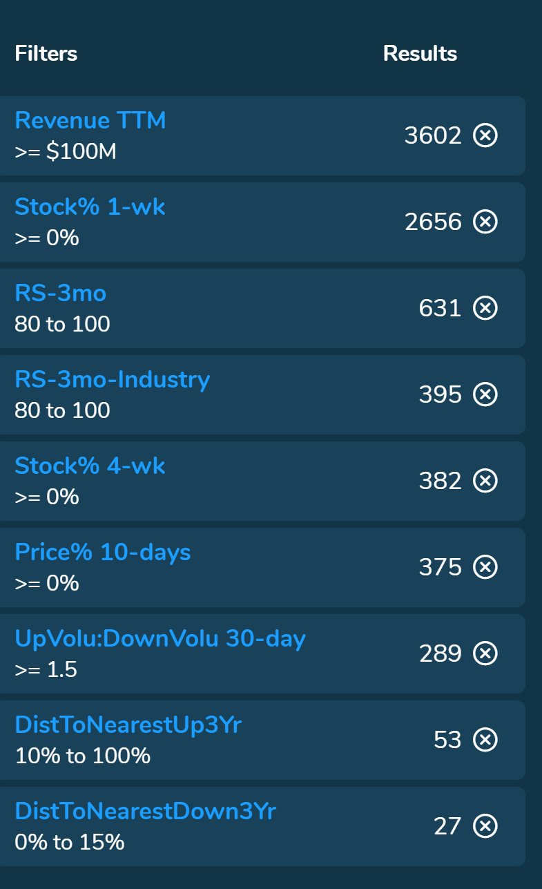
While we’re at it, we might as well impose restrictions that require stocks where there is high relative strength in the short-term (3-months) both relative to the market but also relative to the stock within in its industry peers.
Further, we want stocks where the 30-day buying volume has been significantly larger than selling volume.
We do so with a screen (note that the distance to congestion filters are not yet in Pattern Finder):
Now we turn to three results from this screen.
Turning Theory into Practice
We start with ticker SPOT.
Here is the 3-year chart with Pattern Finder automatically drawing in the congestion lines (pink lines), trend resistance (green line), and trend support (red line).
There is favorable risk:reward.
We zoom in and then discuss:
• The loss zone is nearest congestion ~$115.
• Current price is $123.
• The profit zone is nearest resistance ~$153.
• Buying Strength, measured as up volume : down volume over the last 30-days, is 3.5x.
Here is the snapshot of the volume (from the right hand side menu in Pattern Finder):
We see 3.5x buying volume to selling volume over the last 30-days, a strong RS, and favorable risk to reward characteristics using the nearest congestion on the 3-year chart as our measure.
Next we turn to ticker CERT and the 3-year chart:
And we zoom in; note the distance to support (red line) is smaller than the distance to the next upside resistance (the pink congestion line):
Putting numbers to it we get this:
• Loss zone is support ~$18.
• Current price $19.21.
• Profit zone is next congestion ~$24
This stock has similar relative strength and buying volume to sell volume characteristics as SPOT.
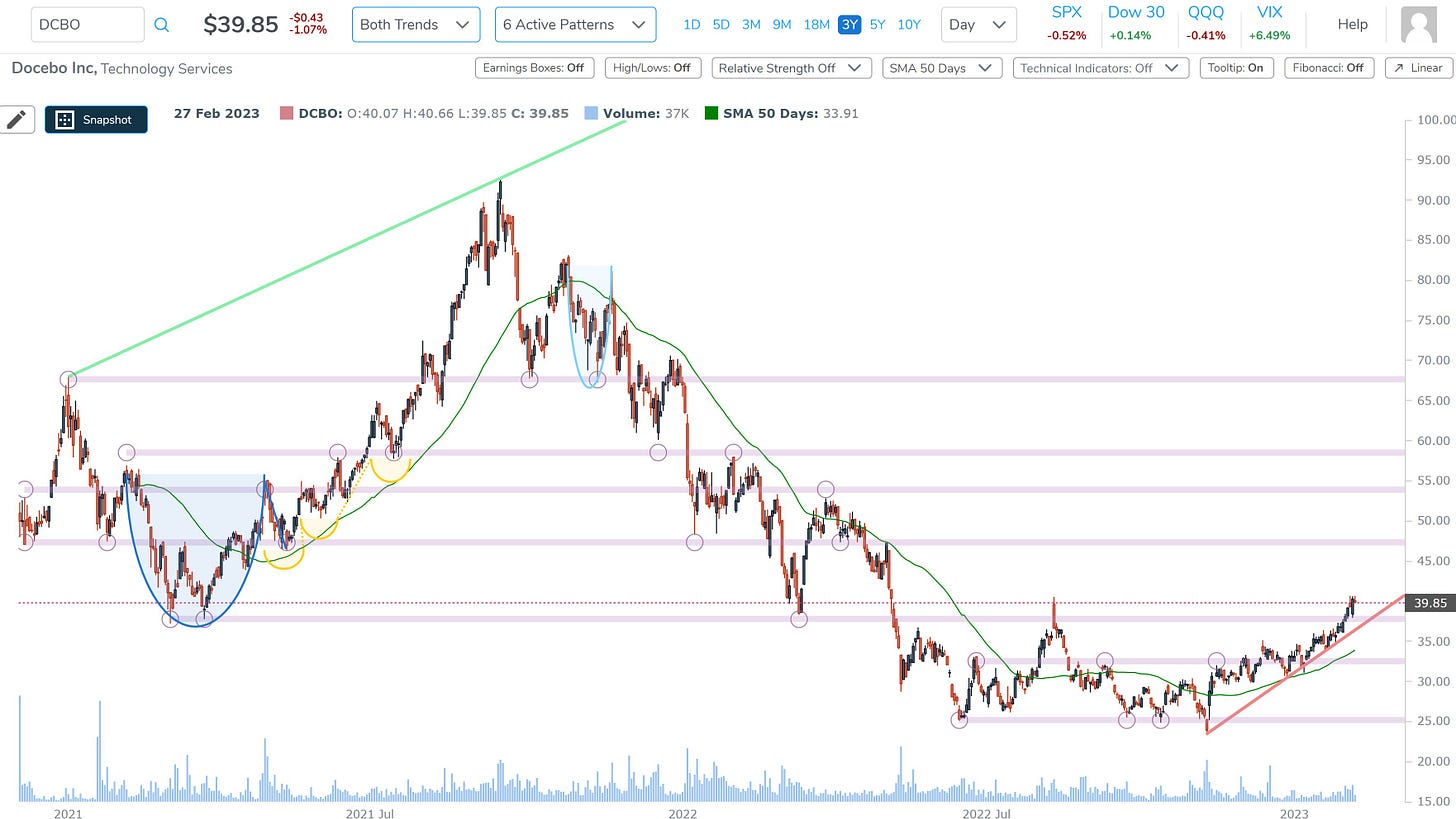
And for our last chart, we turn to ticker DCBO and the 3-year chart:
If we zoom in we see these numbers:
• Loss zone is support ~$38.
• Current price $39.85.
• Profit zone is next congestion ~$47.
We zoom in:
No one can trade for you, but if you use charts, you can extract signal through the power of technology to focus your efforts.
Conclusion
Finding the charts to focus on while avoiding those that don’t have timely set-ups is most of the work if you’re a trader.
However, sifting through this vast amount of information can be a daunting and time-consuming task, which is why we at Capital Market Laboratories have developed a revolutionary tool: Pattern Finder.
We are thrilled to see that our members are finding success with Pattern Finder, and we are committed to providing ongoing support and resources through our platform and trading community.
We include a 5-minute video for you to peruse if you want to learn more:
We invite you to discover the benefits of Pattern Finder for yourself by visiting our website to learn more: Learn about Pattern Finder
Thank you for your continued support and trust.


What does RS stand for in the buying and selling volume with ticker SPOT ?