


Three Bullish Charts; One Optimistic Chart, Two Bearish Charts; One Plummeting


Lede
We look at three more bullish charts and two bearish charts, using our congestion line, trending support, and trending resistance algorithms. Off we go, and for those that want access to the same tools I use here (Pattern Finder), please feel free to check out a review of the software (with two cool videos) here: Pattern Finder.
Bullish Charts
Our first two bullish charts come from our newest screen that looks for buying strength, buying volume, and more room to the nearest upside resistance relative to downside support. Our third chart uses an alternative algorithm search we use for breakouts.
In our first charts we look at ticker EVH.
Pattern Finder draws in our congestion lines (pink lines), trend support (red line), trend resistance (green line), and we draw in the 200-day simple moving average (SMA) as well. Finally we let Pattern Finder draw in the CANSLIM patterns and we highlight the base of a cup with handle with a blue rectangle.

We draw the profit zone to the nearest congestion line with a green rectangle (the “upside exit” in a swing trade) and we draw the loss zone down to the 200-day SMA as the “downside exit”.
We zoom in to see the set up more clearly and add a grey line that highlights the recent uptrend (which the screener all but guarantees we will find):

➼ The loss zone is below nearest congestion down to the 200-day SMA ~$31. We note the base of a cup with handle as a reinforcement of that support.
➼ Current price is $33.09.
➼ The profit zone is nearest resistance ~$39.
➼ There is a rising trend.
Next we turn to ticker SKY, with all the same settings as the prior chart. We note the base of a cup that forms the nearest downside congestion (and thus the loss zone):

Let’s zoom in and peruse the details. Again, we add the grey highlight of the recent uptrend:

➼ The loss zone is nearest downside congestion ~$68.
➼ Current price is $71.97.
➼ The profit zone is nearest resistance ~$82.
➼ There is a rising trend.
And our final bullish chart turns to a different screen; a stock that has broken out above both it’s 18-month and 3-year trend resistance (the green line).
We get ticker CFLT from this screen under the Pattern Breakouts Tab:

And now the 3-year chart, with all the fixings automatically included on the chart.
This time we use the broken resistance as the new support, and we use congestion from a recent top as a lower profit zone target than the next pink line. This is all personal; each trader can create zones as they like:
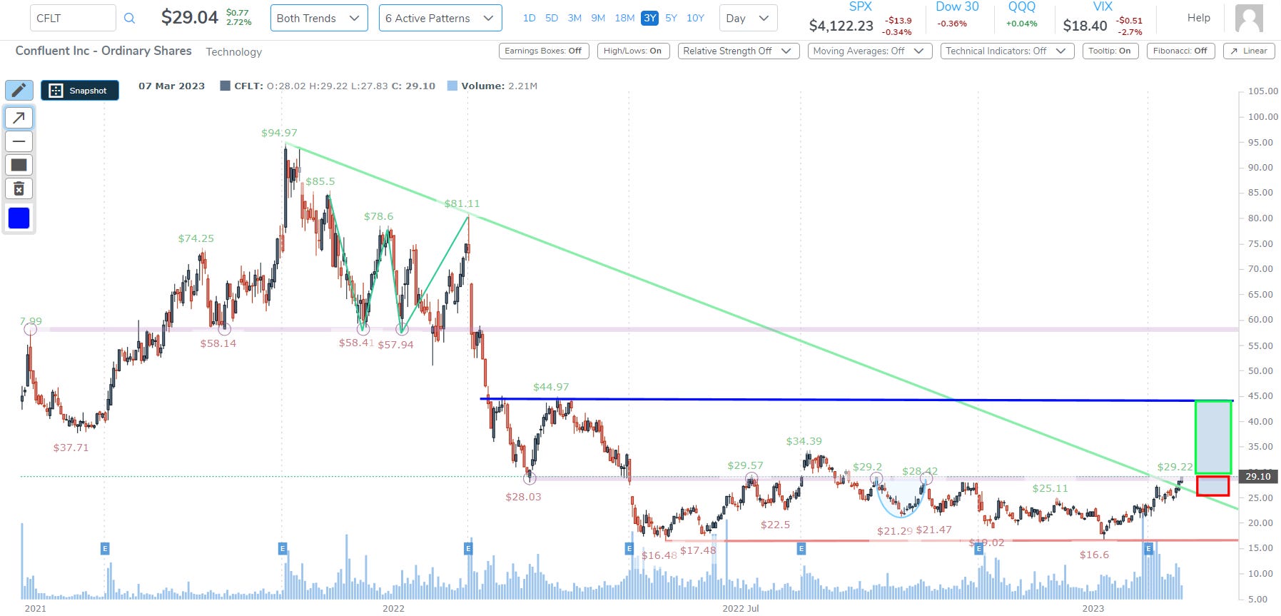
We’ll zoom in for details and again highlight the recent uptrend.

➼ The loss zone is prior resistance ~$26.
➼ Current price is $29.10.
➼ The profit zone is a congestion zone ~$44.
➼ There is a rising trend.
I would characterize this CFLT trade as “quite optimistic,” where the other two were obviously bullish, but didn’t require a new breakout.
Bearish Charts
We’ll make use of the Pattern Breakouts Tab and ‘Bearish Heavy Volume on the Day’ screen for these bearish charts.
We start with a breakdown through support and ticker ARTNA.

We turn to the 18-month chart, and we can see the breakdown.

That gorgeous up trend off of a cup with handle (and an ascending base, prior) has ended abruptly with a break through trend support. We zoom in and see that the next congestion line to the downside at $49 and then the base of that monster cup with handle down at ~$45.

We turn to the screener now:

Here we pluck out ticker AKAM, down on this news (which is in Pattern Finder):

Here is the 3-year chart. Since Substack throttles the size of posts, we put the zoomed in portion inside the larger chart in the center.

A test of support at ~$76 is certainly a possibility.
Conclusion
This was less than 5% of the capability of Pattern Finder.
Soon Pattern Finder members will receive daily emails with trade set-ups like these, but using many more of our chart, fundamental, and relative strength tools.
We invite you to discover the benefits of Pattern Finder for yourself by visiting the page here: Learn about Pattern Finder