


SPX, Strongest Sectors, A Breakout

Lede
Today we review the market at large through SPX, then look at a new feature inside Pattern Finder which identifies the strongest sectors (and industries) and compound that with a screen to find the strength inside the strength, and then finally do our search for stocks with a breakout from resistance.
The Market - SPX
In the post one week prior, we wrote that while shorter-term charts showed SPX at resistance, the longer-term chart was yet more ominous with the index testing long-term support.
Today we update the charts and make the same conclusions. We start with the 5-year chart and note that all of the patterns, congestion lines, and trending support and resistance are automatically drawn in by Pattern Finder.

The index has moved lower in the last week as the chart suggested it might and now we see the index not just at long-term support, but facing congestion formed by the end of an ascending base.
The 3-year chart looks similar to the prior post as well, with a slightly lower index:

That prior ascending base would be the current support level and it is tenuous, as macro data and geopolitics shape the narrative.
Here we zoom in and color the ascending base horizontal line:

But a tenuous market does not mean all areas are tenuous.
Sector and Industry Strength - New Feature
As of this week we will release the sector and industry tab to Pattern Finder. Here is a snapshot from our internal alpha, sorted by 3-month returns in descending order.
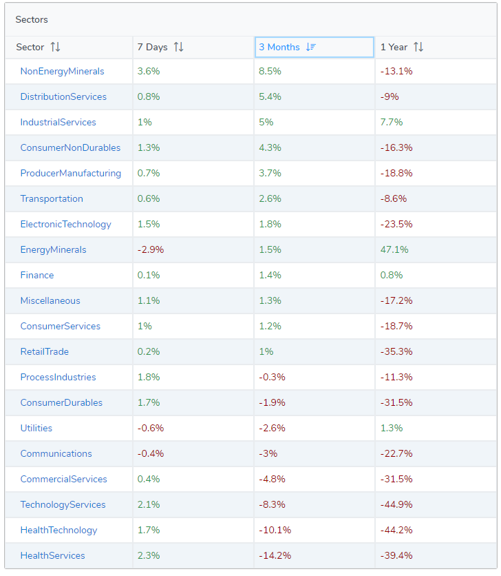
We then took those top four sectors, and created a screen for yet more strength:

We ended up with just ten stocks to focus on that are over a $10 stock price, over $1B market cap, have an industry three month RS over 90 (out of 100) and are up on the week.

We then plucked out Freeport-McMoran (NYSE:FCX) for demonstration purposes. We start with the 10-year chart using monthly candles:
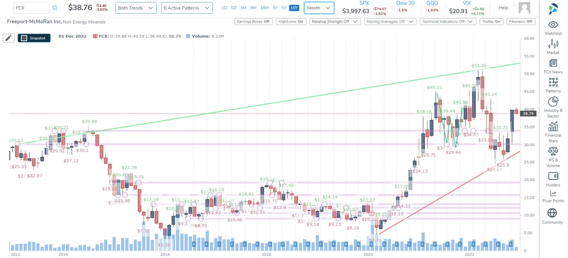
There’s a beautiful bounce off of support, and a recapturing of the lower edge of a the top of a double bottom. Again, this is all automatically drawn by Pattern Finder.
With the long-term chart looking pretty good, we go tighter, to the 3-year chart:

The stock is through the nearest congestion point (also automatically drawn by Pattern Finder), and it makes it possible to draw profit and loss zones.
We drew a profit zone from the current price to the top of a recent cup (which tends to act as resistance, and we drew the loss zone down to the bottom of that same cup which is also (magically!) a congestion zone.
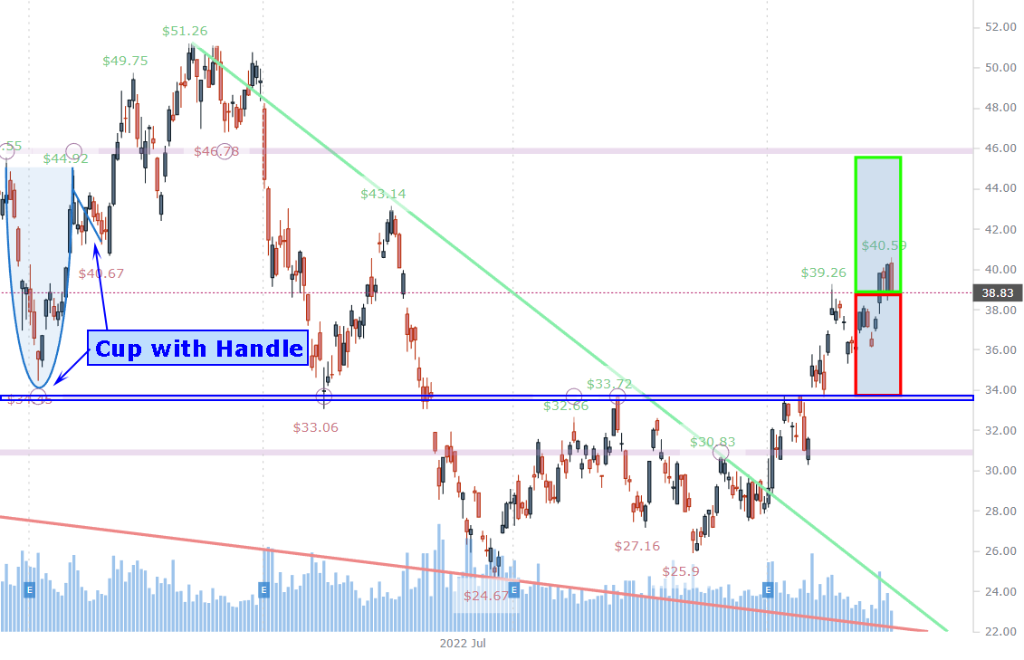
All of the (CANSLIM) patterns are automatically drawn by Pattern Finder.
As the market goes right now, this isn’t a terrible long set-up, although it’s not perfect either.
And finally, we do our search for recent breakouts through resistance:
Resistance Breakthrough
We use the Pattern Breakouts Tab and found Boeing (NYSE:BA):

And then we go ahead and examine the 3-year chart:

BA had that massive drop from $350 down to $90 and has slowly been rebuilding strength.
We zoom into this chart next:
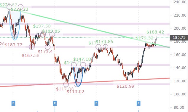
That breakthrough of resistance puts the stock right at the bottom of a cup (which can act as resistance and then support), so a breakout above that patterned mark could leave a nice upside potential to the top of the cup which hits at the $200 range.
This one would likely need a tight stop or even patience for the stock to breakthrough the $189 level (the bottom of the cup), and then… it’s not a bad looking set-up barring macro disturbances.
Conclusion
We truly hope you are enjoying using Pattern Finder and our posts and see how easy it is to improve your trading.
You can watch the video ‘How to use Stock Charts in 5 Minutes’ below and become a member of Pattern Finder if you so choose on the same link:
Thanks for reading, friends.
I set up a watchlist in PatternFinder. I wanted the breakout finder to scan that list, but I could not figure out how. I'm sure you have that, I just couldn't discover the instructions. Thanks for any help.
I think scanner should automatically pick top n sectors(dynamic) rather than some one doing it manually every time sector strength changes.